Dear Bossy Color, aka Annie :) –
I am expecting baby #2 in five weeks – a boy! – and am in the process of setting up his nursery. But I am completely stumped about what color to paint the room.
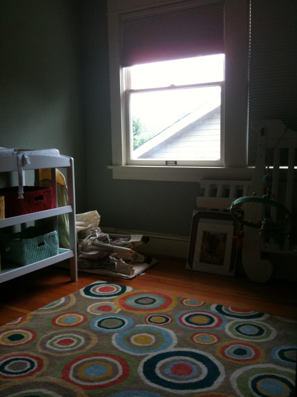
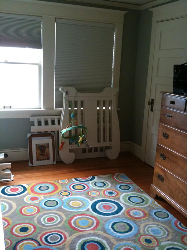
I did remember your advice to start with the rug, and found one that I love!
But now what to do about the walls???
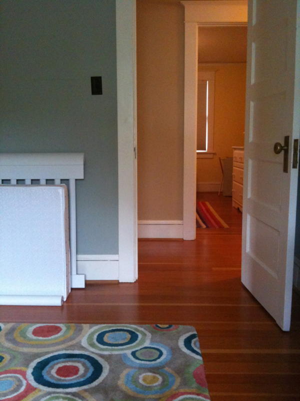
The room is currently painted a grey-blue that I find to be rather blah and washed out. The room has two north-facing windows and doesn’t get a ton of sunlight (you can see from the photos that it enjoys a view of our neighbor’s house and driveway).

Here are my criteria:
– a color to brighten the room, but not *too* bright (we want to encourage lots of sleeping in there);
– a color that works both for a baby’s room and a little boy’s room;
– and we don’t want to paint the trim…
 I was considering Whispering Spring, but worry that it might seem too “baby” in a few years, and also that it might be too cold for the room, though I was intrigued by your recent post about painting your daughter’s north-facing bedroom Ice Blue …
My daughter’s room, which is across the hall, is a color called Devine Butter (from the Miller Paint Natural Blondes collection) and the hallway is a neutral tan.
Thanks for your help!
Michelle

Dearest Michelle,
First things first. Congratulations on the upcoming arrival of Bundle of Joy #2! How terribly exciting.
And congratulations on finding an excellent rug for your nursery, which, of course, is nearly as exciting.
The way bossy color sees it, we have two fabulous options.
1. VIBRANT LIGHT BLUE
Emphasis on VIBRANT. Not subtle, such as the aforementioned “Best of bossy color’s Color” Whispering Spring – you were indeed wise to avoid that lovely but subtle gray-blue in this north-facing room.
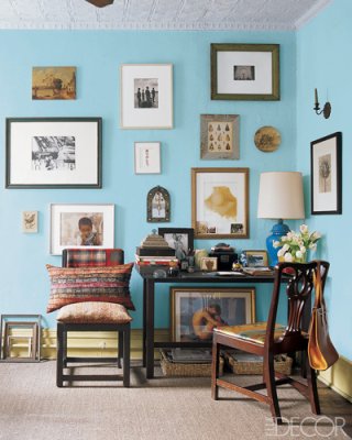
No, we mean a light blue with some kick. Such as Benjamin Moore’s 2054-60 Old Pickup Blue…

 …or, if that has too much aqua, look at a clearer blue, such as Benjamin Moore’s 786 Highland Breeze.
This color will age well. Substitute a sisal rug, striped quilt, and denim beanbag chair when he’s five and you’ll get another 5 years out of the room.
2. DEEP ORANGE/RED
 We bet you’re thinking, “Eek! So dark!”
But let us remind you. The room is dark anyway. So why not simply make it more dramatic by adding a deeper color on the walls? And encouraging lots and lots (and LOTS) of sleep?
It’s hard to tell whether the color in the rug is more red or more  orange, but even if it’s not a perfect match, veer towards orange on the wall. Look at Benjamin Moore’s 2169-30 Oriole or 2011-30 Hot Spice, both are CONSIDERABLY darker than the swatches at right.
Everything else in the room – bedding, chair upholstery, even the frames of art on the walls – could be khaki, or off-white, or light wood. The orange walls will set it off beautifully.
With either color, you might want to think about some simple off-the-shelf curtains over the blackout shades to pull another color out of the rug.
Let us know what you decide, Michelle! Thanks for asking bossy color to weigh in.
Hugs and kisses.
Old Pickup Blue photograph from Elle Decor via xJavierx’s Flickr photostream.
Annie Elliott – aka bossy color – is an interior decorator and design blogger in Washington, D.C. Look for her in the November 2010 issue of Real Simple!

