
Gentle Readers, you now know about the Torpedo Factory. And I was delighted at the lively discussion that ensued. Thank you again for the wonderful tips about where to find art you can live with.
 Now let’s get down to brass tacks, shall we?
Who among the artists at the Torpedo Factory stood out for bossy color?
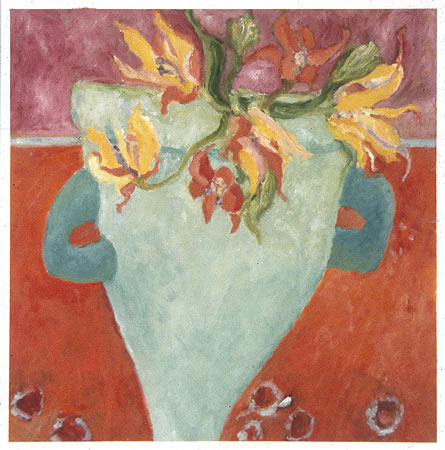
Let’s start with the printmaker Cora J. Rupp, who says, “Color is my first love, and what my work is all about.”
I mean, really. I should put that on a t-shirt.
Ms. Rupp’s abstracted botanical monotypes are just lovely. (Prints have the added benefit of being extremely affordable.) The one above is “Parrot Tulips,” and this one is called “Nan’s Wonderful Pitcher.”
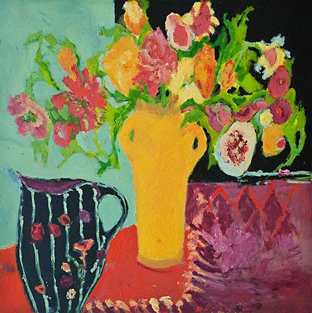
Couldn’t you see these in a living room? A bedroom? A foyer? Wouldn’t you love to have these flowers greet you as you walk through the front door?
If your taste leans toward the more traditional, the landscapes of Marietje Chamberlain could be perfect. These photographs do not do not do the work justice; you lose the subtleties and depth of the pictures. This is called, “Morning on the Creek.”

And these are called, “Water Way I and II (diptych):”

The horizontal orientation makes these great for a living room (for that hard-to-fill space over the sofa) or above a sideboard in the dining room.
Art is a personal thing, and we all have different taste. But no matter what you buy, it should be well done. Good quality. High caliber.
It’s hard to say this without sounding snooty, but there is some bad art out there. Which doesn’t mean those artists shouldn’t continue to express themselves on canvas, or paper, or clay…
…it just means you shouldn’t buy it.
So please, to protect your delicate sensibilities – and those of of your family and guests – purchase carefully. You won’t go wrong with these recommendations.