• Skip to main content
  • Skip to header left navigation
  • Skip to header right navigation
  • Skip to site footer
  • about
    • services
    • team
  • portfolio
  • press
Annie Elliott Design, Washington DC

Annie Elliott Design

Greater Washington DC

  • book
  • blog
  • contact

Bossy color’s living room, Part 10: Acceptance (and more on upholstery)

Annie Elliott | April 26, 2010

How does that serenity prayer go? Something about accepting the things you cannot change, trying to change the things you can, and the wisdom to know the difference?

Well, that’s me right now. Serenity 101.
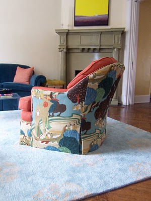
My living room chairs are back. You’ll recall that there was a problem with the upholstery: the back pattern wasn’t lining up, part of the front was orange when it should have been patterned, etc. etc.

Several weeks, many phone calls, a lot of angst, and 2 additional yards of fabric later, the chairs are at a point where I can accept them.

The “before” (not the “way before,” with different fabric, but the “recent before”) is above. The “after” is below. Look carefully, and try not to laugh. There IS a difference.
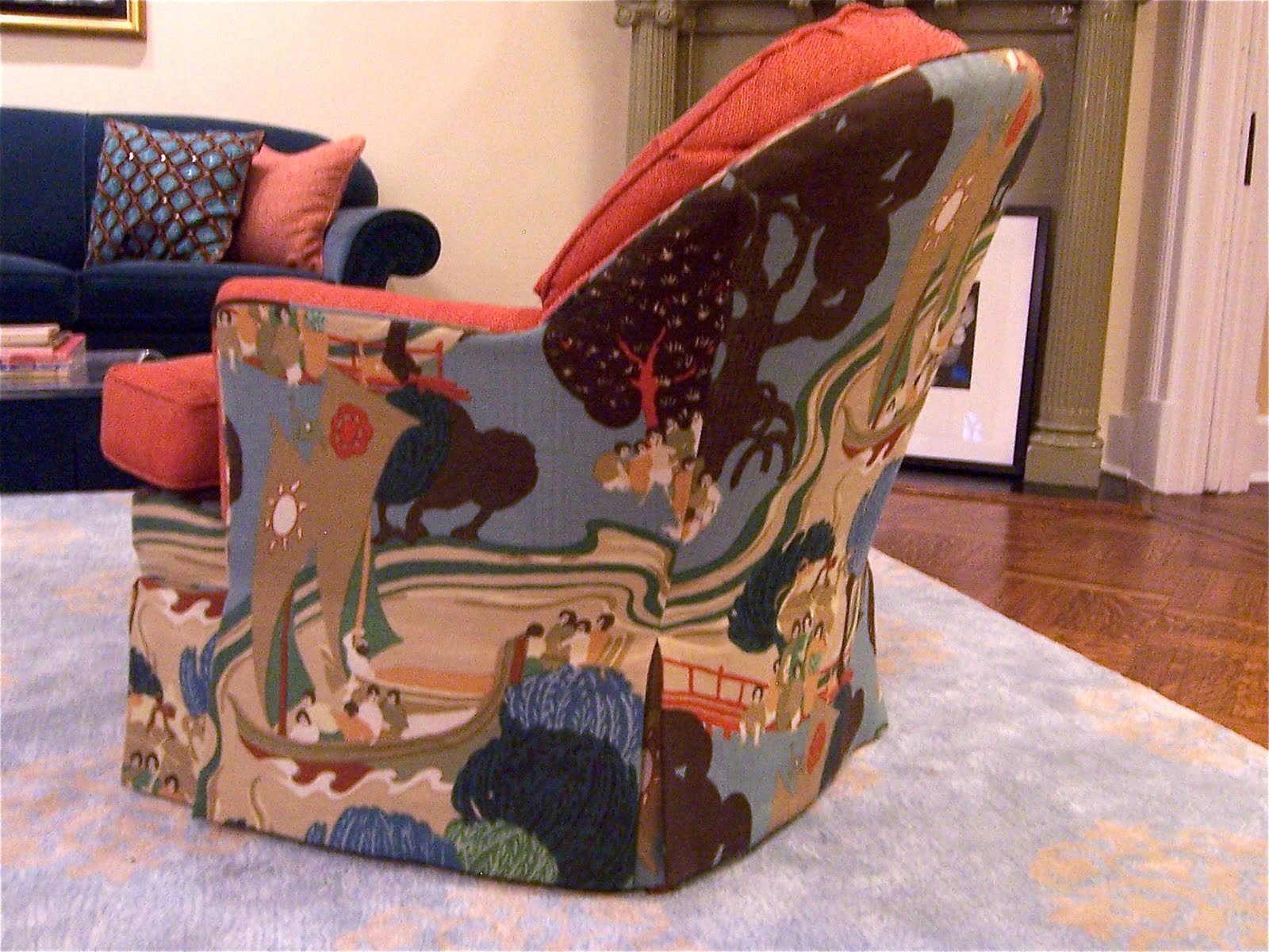

Don’t see it? Here’s the other chair. (Hint: follow the wavy lines.)
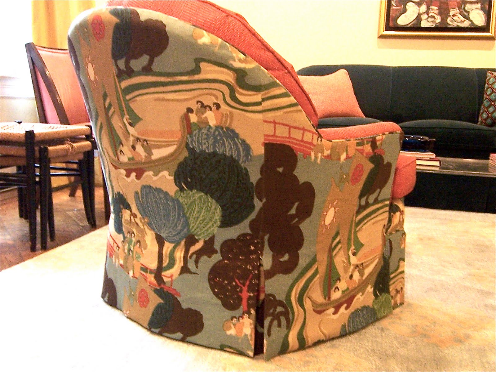

There’s no question that the first upholstery attempt was unacceptable. But this is what I learned: The pattern is SO HUGE – it’s a 26″ repeat, vertically and horizontally – that if we lined up the pattern exactly, across all three panels, the sides of the chairs wouldn’t have any focal point. That ship that right now is centered pretty well on each side? You might only see a piece of it if we lined up the pattern perfectly. Does that make sense? (It took me a while, believe me. And I do this for a living.)


The compromise was to line up the wavy water lines to provide a good transition between the back and side panels of the chair. Each panel has a focal point, and the seams are less offensive than they were before.

This, truly, is as good as it’s going to get. (Said through gritted teeth:) I…accept…that.

Here’s what DOES make me happy:
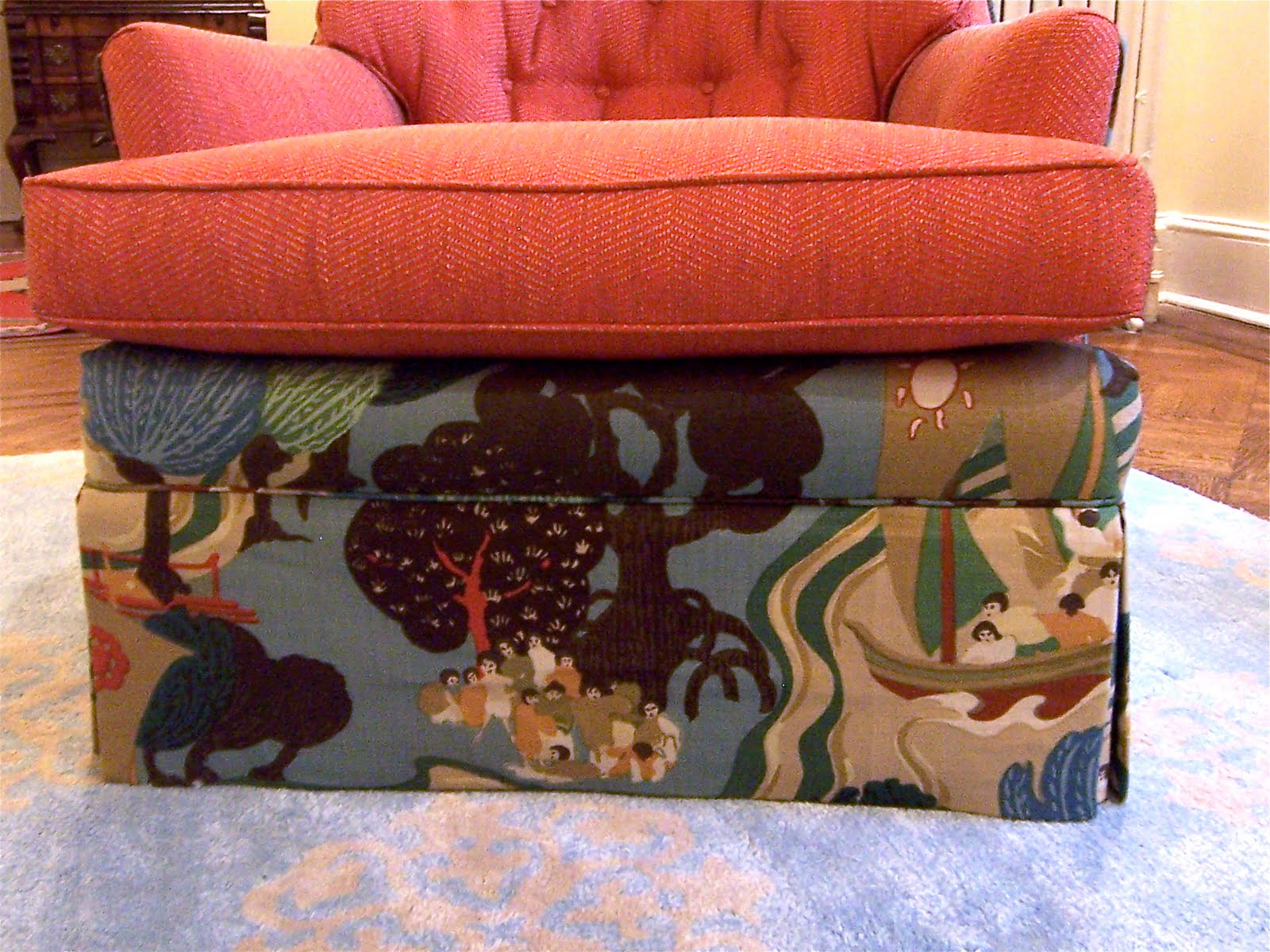

The front skirt does line up with that part below the cushion (help me with the vocab again, designers among you?), which is now the patterned fabric, not the orange. That was just odd.

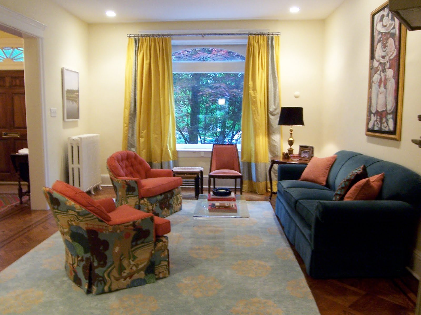
So. Here’s how the room looks now. Drum roll please.
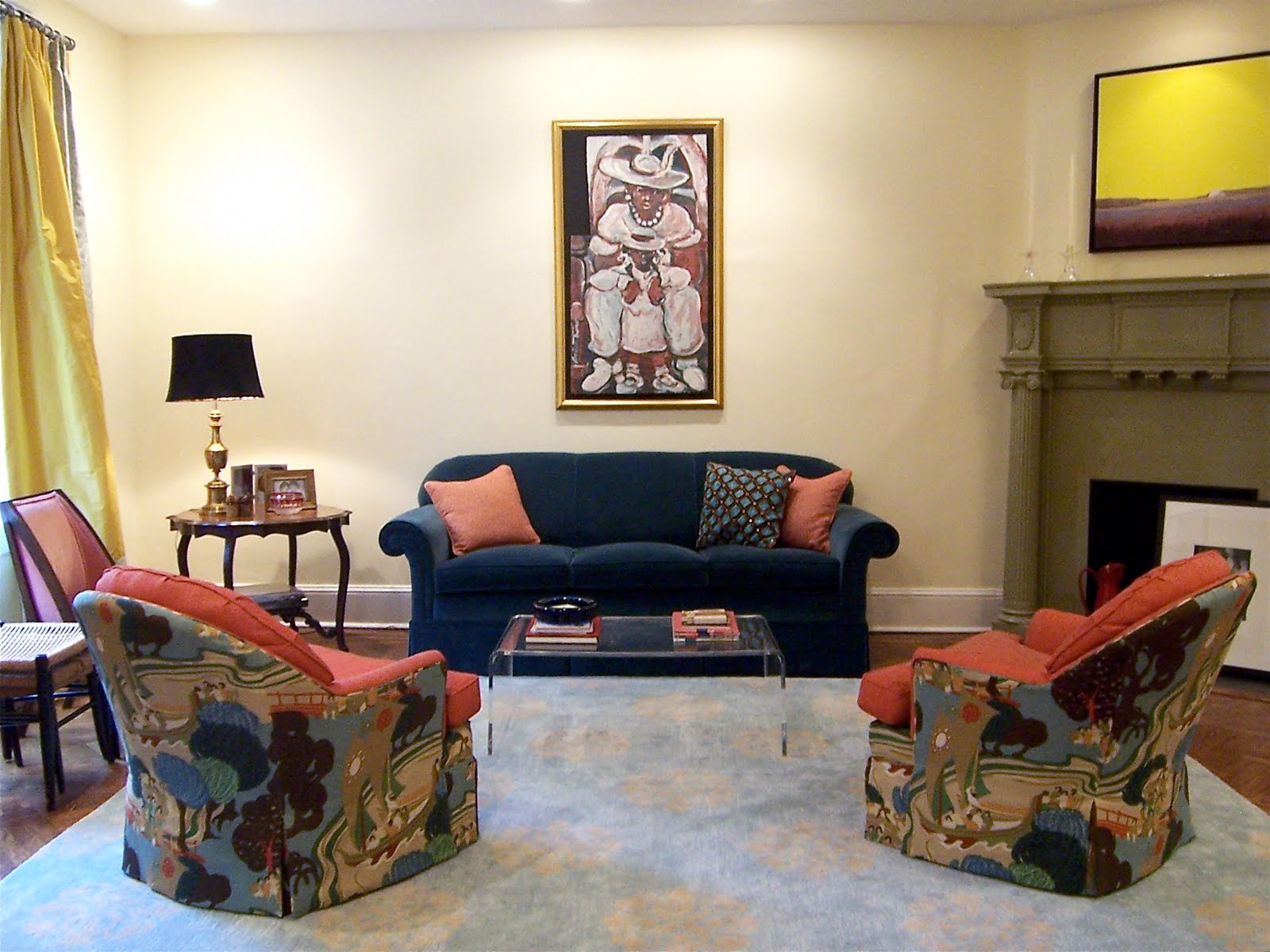

A new lamp is en route to replace the orange one at the left of this picture:
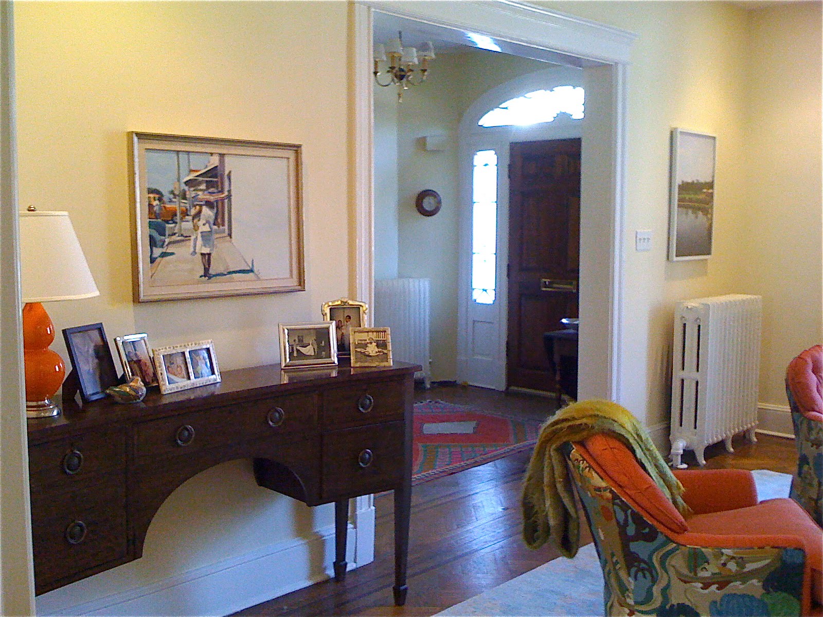

The lamp is too small – I “stole” it from my office when we were having that event here – and I feel like the orange is now overpowering the yellow in the room. So the new lamp is blue.

Next stop: a new coffee table. We all know that re-upholstering is expensive, so we’ll be going the bargain route on that. Wish me luck.

You know I’ll keep you posted. Serenity now…serenity now…

Category: Furniture + upholstery, Living Room + Family RoomTag: bossy color's house, furniture

Sidebar

Subscribe


Bossy Color Blog

Categories

  • Art + accessories »
  • Bedroom »
  • Color + paint color »
  • Dining room »
  • Furniture + upholstery »
  • Kids »
  • Kitchen + bath »
  • Lighting »
  • Living Room + Family Room »
  • Renovation »
  • Rugs »
  • Wallpaper »
  • Window treatments »

View Portfolio

view Bossy Color's portfolio

Instagram

annieelliottdesign

View Instagram post by annieelliottdesign

Sep 22

Open post by annieelliottdesign with ID 17934708156387896
“Isn’t ‘modern farmhouse’ over yet?” I loved speaking with @authordinacheney @washingtonpost about the worst interior design trends! Turns out I’m not the only designer with strong opinions 😊@vincentewolfdesigns @kimletgordon @maxsinsteden #interiordesign #washingtonpost #designopinions #annieelliottdesign

annieelliottdesign

View Instagram post by annieelliottdesign

Sep 18

Open post by annieelliottdesign with ID 17989063023104856
Best part of being an interior designer is using your own home as a playground for creative ideas! We changed the paint in our living room again and here’s how it looks now! #interiordesign

annieelliottdesign

View Instagram post by annieelliottdesign

Sep 17

Open post by annieelliottdesign with ID 18125330714481993
When you become an empty nester, when is it ok to reclaim your adult child’s space? Check out my latest blog post for my recommendations on how to approach empty nesting!📸 @stacyzaringoldberg📸 @kipdawkinsphoto📸 Michael Wilkinson📸 @angieseckinger

annieelliottdesign

View Instagram post by annieelliottdesign

Sep 10

Open post by annieelliottdesign with ID 17906571285498443
Pink, green, and a splash of dark orange come together to create this sunny, summery bedroom 🪷

annieelliottdesign

View Instagram post by annieelliottdesign

Sep 9

Open post by annieelliottdesign with ID 18104009318233584
It’s Wallpaper Wednesday! This week, feast your eyes on @timorous_beasties Fruit Looters. TB claims that William Morris’s Strawberry Thief pattern inspired Fruit Looters, but only the name indicates the connection: Strawberry Thief, Fruit Looters…get it? Whereas Morris’s iconic pattern is medium-scale, rhythmic, 2-D, cartoon-like, and muted, Fruit Looters is the opposite in every way but subject matter. The scale is huge, with the foliage “stripes” providing a geometric order, and it oozes TB’s trademark edginess. The crisp pattern is finely drawn; pull it apart, and each element — a flower, a bird — could be in an English botanical print. Fruit Looters comes in vivid, saturated colorways, some with a metallic sheen, and dramatic black is present in all.Recently, a client (who originally introduced me to Timorous Beasties!) and I used Fruit Looters wallpaper in her stairwell, in the Alabaster colorway. The drama. Oh, the drama!

annieelliottdesign

View Instagram post by annieelliottdesign

Aug 27

Open post by annieelliottdesign with ID 18339370936281789
SO much fun to create this entertainment space! This client already had a living room and kitchen…this space is for friends and family to relax, talk, and just BE. What’s your favorite feature?

annieelliottdesign

View Instagram post by annieelliottdesign

Aug 26

Open post by annieelliottdesign with ID 18618812233051872
Happy Wallpaper Wednesday! There’s no better paper to feature in August than Schumacher’s Citrus Garden 🍋 🍊.The Swedish designer, artist, and architect Josef Frank created the Citrus Garden pattern as a fabric in 1947. The hand-drawn, whimsical, quintessentially mid-century, irresistibly cheerful design exemplifies Frank’s philosophy: “The freer the pattern, the better.” I’ve used Citrus Garden fabric a few times, but shockingly, the pattern wasn’t on wallpaper until 2017!! 🤯 Deprived for so long!! As soon as the opportunity arises, I’m running, not walking, to get my hands on this wallpaper.@schumacher_midatlantic 📸 @angieseckinger

annieelliottdesign

View Instagram post by annieelliottdesign

Aug 19

Open post by annieelliottdesign with ID 17979208500097924
All of a sudden, novelty accent lamps are EVERYWHERE! Some are cute, some are…inadvisable ;) If you just can’t resist a lamp in the shape of a snail, my latest blog post has recommendations for proceeding responsibly💡

annieelliottdesign

View Instagram post by annieelliottdesign

Aug 12

Open post by annieelliottdesign with ID 18109874522009739
Happy Wallpaper Wednesday! Let’s talk about Cole & Son’s Acquario, shall we?Iconic Italian artist Piero Fornasetti designed Acquario for Cole & Son in the early 2010s. He was going through an ocean phase, captivated by its mysterious depths 🐠, so he developed this fish design and put it first on plates and fabrics, and then, luckily for us, on wallpaper. We just installed Acquario in the Print Room Blue colorway in a client’s tiny practice room (he plays classical guitar), and we LOVE it! That big old blowfish, just gliding along…he kills me.Featuring: @cole_and_son_wallpapers @fornasetti
Follow

Looking for something?

Don’t miss a single post


Where classic and modern hang out and drink gin.

  • Instagram
  • TikTok
  • Pinterest
  • Facebook
American Society of Interior Designers Firm Partner

© 2026 · Annie Elliott Design · privacy policy