• Skip to main content
  • Skip to header left navigation
  • Skip to header right navigation
  • Skip to site footer
  • about
    • services
    • team
  • portfolio
  • press
Annie Elliott Design, Washington DC

Annie Elliott Design

Greater Washington DC

  • book
  • blog
  • contact

Accent wall checklist. You asked about it, kind of.

Annie Elliott | March 30, 2010

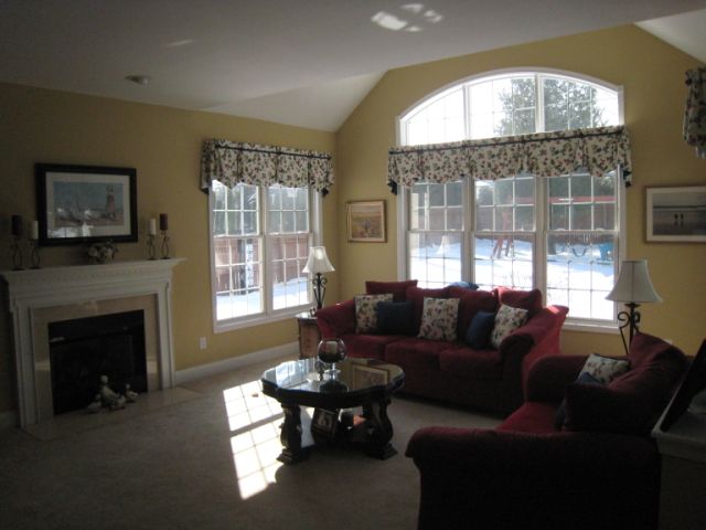
Hi Annie, I know that you aren’t particularly fond of accent walls,* but my husband wants one in our family room! Our kitchen opens up into the family room. We have white cabinets and we are painting the walls in the kitchen Benjamin Moore’s New Providence Navy. In the family room, three out of the four walls will be painted with B. Moore’s Yorkshire Tan.


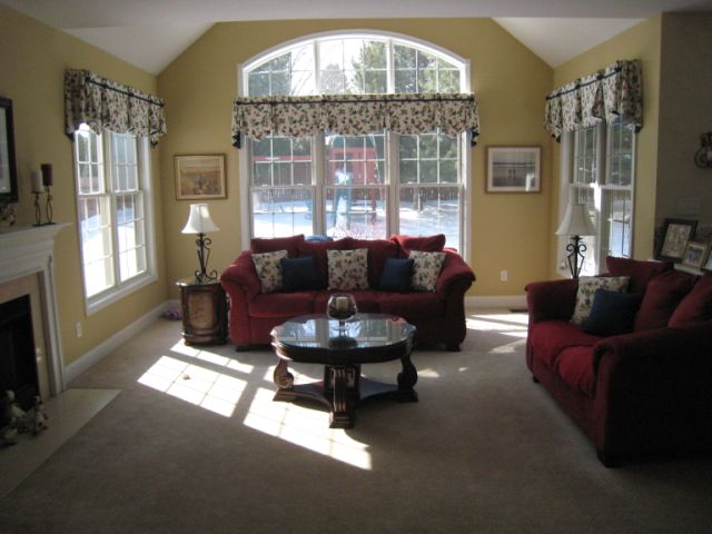
The problem is which wall to accent w/the navy color in the family room. I think it should be the wall w/the Palladian window, but my husband thinks that the fireplace wall should be accented…

BTW – disregard everything in the photos except the walls b/c we are doing the room over from top to bottom.

Thanks Annie for any suggestions you may have! – Ann Marie


Dear Ann Marie,

I’m so glad you’re bringing this up, because *I have gotten such a bad rap about “the accent wall.” I simply feel it is more susceptible to abuse than any other design device. Perhaps because it’s so easy to paint? Because it’s a relatively low-risk way of making the painter believe he or she is being creative?

I am not flat-out opposed to the accent wall. In fact, I recently suggested that a Gentle Reader in Canada use a dark purple accent wall in her dining area.

And in this apartment, I suggested blue accent walls in the guest bedrooms – white on the other walls. Very edgy.

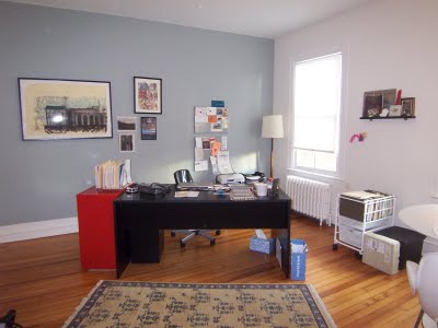
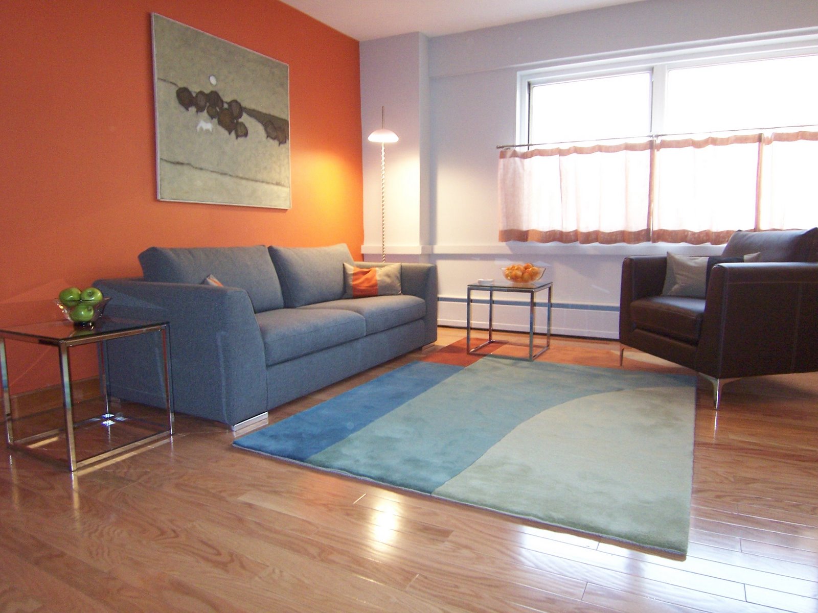
I myself have been known to use accent walls, most recently in my very own office. (The accent wall – first orange, then gray – has since been painted over, but I enjoyed it at the time.)


Yes, Ann Marie: bossy color believes that there is a time and place for everything, even the accent wall.

Except in your living room.

It pains me to say this, because you already may have acted. But there are so many windows in your already open family room that a dark accent wall will chop things up further. Especially one that’s so dark. (1651 New Providence Navy is a beautiful color, by the way. I think it will look great in your kitchen.)

These are the acceptable situations in which to use an accent wall.

  • To define an area within a larger space. The dining or living end of a larger, multi-use room, for example.

  • Or if the room is enclosed and extremely boring. i.e., a bedroom with a doorway on one wall and a window on another. In this case, it’s ok to paint the UN-windowed UN-doored wall – the wall the head of the bed will be against – an accent color.

BUT, if:

  • You love vivid colors but think that using it on all 4 walls would be too much, you must stop. This is not enough of a reason.
  • You want a splash of color but don’t know how else to do it, your also must stop. The accent wall should not be a default decision. There are lots of other ways to incorporate color. A bright rug. A series of smaller accents in the same color: pillows, throw, lamp. Highly effective, less of a commitment.
  • You are at a loss as to how to bring interest to a space, stop and contact bossy color immediately.

Again, Ann Marie, I’m terribly sorry I couldn’t give you better news. It’s not always easy being bossy color, but I take the responsibility very, very seriously.

Category: Color + paint color, Living Room + Family Room

Sidebar

Subscribe


Bossy Color Blog

Categories

  • Art + accessories »
  • Bedroom »
  • Color + paint color »
  • Dining room »
  • Furniture + upholstery »
  • Kids »
  • Kitchen + bath »
  • Lighting »
  • Living Room + Family Room »
  • Renovation »
  • Rugs »
  • Wallpaper »
  • Window treatments »

View Portfolio

view Bossy Color's portfolio

Instagram

annieelliottdesign

View Instagram post by annieelliottdesign

Jun 17

Open post by annieelliottdesign with ID 18106157639319026
“Much of the wallpaper [in the Victorian era]—fabric, too—was made with arsenic,’ explains Elliott. ‘There are worse ways to go, I suppose.’”I loved speaking with @allisonpduncan @vogueliving about the art of using two wallpapers in one room. Happy Wallpaper Wednesday!#interiordesign #wallpaper #vogueliving #designopinions #annieelliottdesignSlide 1 📸  by Stacy Zarin Goldberg, Design by Annie ElliottSlide 2 📸 by Leslee Mitchell, Design by Kim ScodroSlide 3 📸 by Donna Dotan, Design by Ariel OkinSlide 4 📸 by Gordon Gregory, Design by Jenny Holladay

annieelliottdesign

View Instagram post by annieelliottdesign

Jun 13

Open post by annieelliottdesign with ID 17913412296404982
Pink, light yellow, and gold-y tan combine to create a soft, unexpected color palette. The quiet colors are sophisticated together, and the palette will age beautifully as this tween moves through high school and college. (Her parents won’t even have to redecorate if it becomes a guest bedroom someday! But one step at a time…)#homedesign #paintinspo #bedroomdesign

annieelliottdesign

View Instagram post by annieelliottdesign

Jun 10

Open post by annieelliottdesign with ID 17929516656341682
Deep down, I believe that a house isn’t a home without wallpaper 😊 My latest blog post identifies five unexpected places you can use wallpaper — and some are small! Wallpapering the space behind your island stools could be your gateway to my favorite home furnishing. If you have other creative spots for wallpaper, I’d love to hear about them!#wallpaperinspo #interiordesign #wallpaper

annieelliottdesign

View Instagram post by annieelliottdesign

Jun 9

Open post by annieelliottdesign with ID 18112589929761575
Welcome to my new before-and-after series! 🥰 I take you through my thinking as I design a space — my “process,” as it were. Pretty pictures are involved too, of course. I hope you enjoy it!This was a super fun project: a historic townhouse with the challenge of a loooong shoebox-shaped front room. You know the kind. Here’s how we made this color-and-pattern-loving client’s challenging space amazing. Like this series? Please let me know! #interiordesigner #windowtreatments #wallpaper

annieelliottdesign

View Instagram post by annieelliottdesign

Jun 5

Open post by annieelliottdesign with ID 18087273683080656
Don’t let your porch be a throwaway space! Make it a room. Get a high quality indoor/outdoor rug. Make sure your furniture is COMFY. Find a cordless lamp (they’re everywhere now!). Hang art! You can even add a vintage console table or cabinet if you’re ok with it weathering over time 🕰️. #interiordesign #porchdesign

annieelliottdesign

View Instagram post by annieelliottdesign

Jun 3

Open post by annieelliottdesign with ID 18314336014263171
It’s Wallpaper Wednesday! This week we feature Paper Trail by Lewis and Wood. Lewis and Wood launched Paper Trail in the fall of 2025 as one of four patterns in their History Papers Collection. Paper Trail was inspired by ancient rock carvings - 600–2,000 years old! - from various sites in America. It was named after the site Newspaper Rock, Utah.You know I love anything with an animal :) But there are 2 genres, right? Juvenile and…let’s call it *versatile*. To me, Paper Trail falls into the latter category, featuring deer, horses, buffalo, and foxes on a background that resembles the texture of rocks. It’s primitive, not cartoonish. I could see using this in a small bedroom; a breakfast nook (why? Can’t tell you, it’s just a feeling); or a hallway, because the pattern isn’t overwhelming.#wallpaperinspo #interiordesign #homedesign

annieelliottdesign

View Instagram post by annieelliottdesign

May 28

Open post by annieelliottdesign with ID 18102883841082172
For those of you lucky enough to have a beach house, now’s the time to start thinking about decorating beyond traditional “costal decor!” Step one? Consider a color palette other than blue and white ;) See my latest blog post for more! 🏖️ 🐚#beachhouseinteriors #interiordesign #eastcoast

annieelliottdesign

View Instagram post by annieelliottdesign

May 22

Open post by annieelliottdesign with ID 18125488516719287
I follow two rules when mixing patterns in the same space: vary the scale, and vary the subject.I was excited to share this and other insights on pattern splicing with @ericafinamore from @apartmenttherapy! #interiordesign #patternsplicing #patternmixing #designopinions #annieelliottdesign

annieelliottdesign

View Instagram post by annieelliottdesign

May 20

Open post by annieelliottdesign with ID 18082241465136951
It’s Wallpaper Wednesday! This week we’re featuring Deconstructed Stripe by Schumacher (in collaboration with Miles Redd).This pattern pays tribute to the legendary decorator Albert Hadley. Redd was inspired by Hadley’s contemporary, streamlined designs that played with scale and proportion. Deconstructed Stripe is impactful on its own but also looks INCREDIBLE next to other patterns.@schumacher1889 #designinspo #wallpaper #interiordesigner
Follow

Looking for something?

Don’t miss a single post


Where classic and modern hang out and drink gin.

  • Instagram
  • TikTok
  • Pinterest
  • Facebook
American Society of Interior Designers Firm Partner

© 2026 · Annie Elliott Design · privacy policy