I was so nervous about the whole holy-cow-I-can’t-crack-the-code-on-my-own-living-room-and-people-pay-me-good-money-to-tell-them-what-to-do-with-THEIR-living-rooms thing that I jumped right into the saga.
Let me back up.
When I was feeling despondent about no longer having a living room sofa (and no rug), I stumbled across this picture from the fantastic blog Cote de Texas, and my life was changed forever. (Naturally I can’t find this picture online anymore, so this is a fuzzy shot of the tattered printout that now lives in my bag.)
The cheerful yellow drapes and elegant robin’s egg blue sofa, the mismatched prints on the chairs, the traditional yet lighthearted feel…the friendliness of it all. I just fell in love with it. And, unlike many of the pictures we see in magazines (or in blogs), I thought it looked accessible. I can replicate that, I thought.
Easier said than done, Gentle Readers. As many of you undoubtedly know.
I tried to follow my own excellent advice and start with the rug. When you have a room that’s completely empty, this is the best way to begin.
But of course, in real life rooms are rarely completely empty.
In my case, I have a glossy greenish grey fireplace I wanted to work with. The green was actually very successful in balancing the green drapes that had been taunting me. Come to think of it, painting the fireplace green was the best thing I did to make those drapes work in this room…
But the room wasn’t making me happy. It looked nice, but it wasn’t me.
Within a matter of days, I took down the green drapes, got rid of the decrepit sofa, was forced to remove the rug, and stumbled across the Cote de Texas picture, which totally validated my desire to use the yellow drapes I already had (once that purple stripe was replaced).
Now on to the rug. I could still use the Flokati if I wanted to. It’s ok now…it’s happily ensconced in our bedroom.
But can you make out the rug in the Cote de Texas picture? It’s predominantly a lighter shade of blue than the sofa…and at that point, I thought the blue was pretty important to making the whole room work. (Even though I was a little nervous about playing up the blue in this north-facing room.)
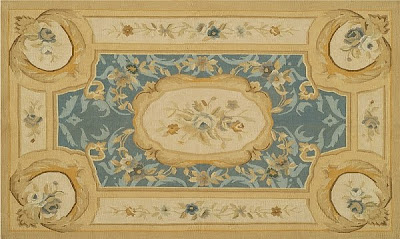
An Aubusson rug, with delicate pastel-y colors? Ultimately, I decided that an Aubusson rug would be too feminine.
For my own house, I tend to prefer older rugs – Persians, Orientals, etc. But my go-to resource for inexpensive Persian and Oriental rugs, Rugman.com, wasn’t turning up anything in the right colors. I wanted medium blue or yellow, not red or navy. So I started looking at contemporary rugs.
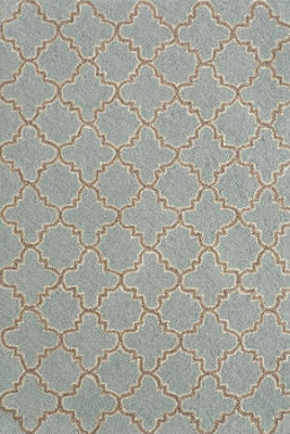
Dash & Albert’s Plain Tin Hooked Rug was the frontrunner for a while. But when it came time to pull the trigger, I just couldn’t. I thought this particular blue would be awfully cold, and it’s 8 x 10…we ideally need a 9 x 12.
Then Anthropologie’s Vernal Cusp Rug seemed like the answer. It comes in a 9 x 12, has all of the colors I planned to use – even a green, which I thought would help tie in the fireplace. But I finally decided the rug would be TOO matchy matchy, and I would be forced to use a solid or really subtle fabric on the sofa and chairs. When you have a multicolored, busy rug, it really needs to be the star of the show.
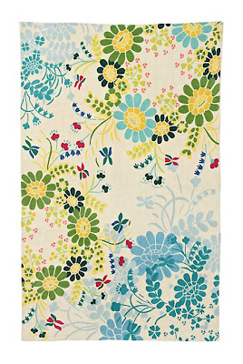 This is a great example of a solution that could have been perfect for a client who DOESN’T want wacko chairs in their living room. But I do, I think. And I’m not willing to let the room be all about the rug. I’m also a little concerned that the art might be overshadowed. Mistake? We’ll see.
Madeleine Weinrib – a fabulous resource for cotton flatweaves – didn’t have the right answer, either. Close, but something held me back.
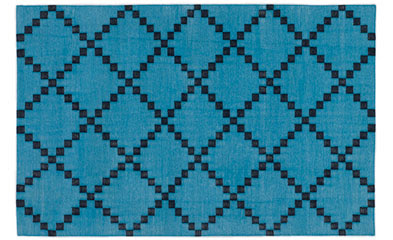

I love Galbraith & Paul, but they’re out of my price range right now.

 But you can see what was happening: the blue idea was falling by the wayside, and I was finding myself drawn more and more to gold and white rugs. I kept coming back to Anthropologie’s Coqo rug in Goldenrod. The yellow looked like it would be strong enough for the drapes – which are quite rich.
It only came in an 8 x 10, but maybe that would be ok…
I pulled the trigger and placed the order. Curses! Backordered until early January! I took it as a sign: keep looking.
I went back to another of my go-to rug resources: RugsUSA.com. I narrowed it down to three, and finally chose this one, from Jaipur rugs:
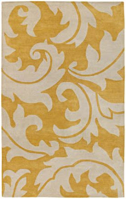
Crazy? Quite possibly. And it’s 8 x 11, not 9 x 12 (but also not 8 x 10). But the gold color is nice and strong, and the huge scale of the pattern is kind of liberating.
As I write this, I’m not 100% certain I’ve made the right decision. I still have a few days to return it, pain in the neck though that would be. But something tells me this one is going to work out in the end.
And if it doesn’t, well, it would look great in the bedroom.