• Skip to main content
  • Skip to header left navigation
  • Skip to header right navigation
  • Skip to site footer
  • about
    • services
    • team
  • portfolio
  • press
Annie Elliott Design, Washington DC

Annie Elliott Design

Greater Washington DC

  • book
  • blog
  • contact

You asked…about rejuvenating wallpaper via the trim color

Annie Elliott | November 30, 2009

Dear Annie,
I have a cream-background wallpaper in the dining room and have painted the trim with the same [cream]: Benjamin Moore Mystic Beige 2162-60. I painted the wall below the chair rail a deep red (Ralph Lauren’s Nobleman VM74), which picks up color in the wallpaper and drapes.


The wallpaper is old, probably vintage 1967 from the year the house was built, but it’s in great shape and my family all voted to keep it. I’m painting everything else around in an attempt to rejuvenate the room. The living room, visible in the cream molding photo, is painted Benjamin Moore Atrium white with bright white trim.


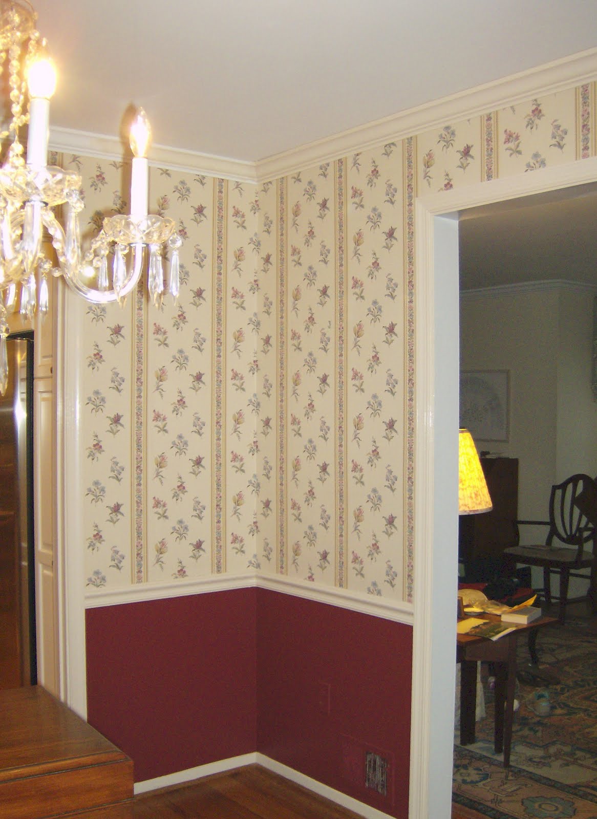
What do I do with the ceiling and the crown molding? They are both a bright white and it looks odd. Should I paint the crown the same creamy trim color and the ceiling white? Both the cream? All the rest of the ceilings, crown and trim in adjoining rooms are bright white. Thanks for the tips and I love the blog.
-Dale Glass, Potomac, MD


Dear Dale: Wallpaper is back in a big way – especially in dining rooms – so your question is quite timely.

The short, easy answer is CREAM: go with your instincts and paint the crown moulding the Mystic Beige in the semi-gloss finish, and paint the ceiling the same color in a flat finish.

But that’s not a very bossy answer, is it? Tasteful, yes. Imaginative, not hardly.

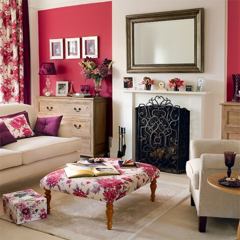
Here’s why I couldn’t let go of your question. If you and your family are bold enough to keep wallpaper from 1967, I think you should set it off a bit more. The deep red wainscoting is perfectly nice, but paired with the wallpaper – and the alluded-to drapes – I’m getting an 80’s vibe.


I don’t think the wallpaper is kitschy enough go the ironic route…by, say, painting the wall below the chair rail an outrageous contrasty color like hot pink, or a bronze metallic. Judging from the sliver of living room we glimpse in one of your photographs, that’s not how you roll anyway.

So a better route would be to channel our inner Brits and ask ourselves, WWF&BD? (What Would Farrow & Ball Do?)

What if we painted all of the trim a greyish blue (Oval Room Blue #85) and the wall below the chair rail a greenish grey (Pigeon #25)? Neither color would match the wallpaper exactly; these are intentionally more muted.


So what would happen? I’ll tell you what would happen. Interesting but elegant gorgeousness, that’s what would happen. (And you could keep the ceiling cream.)

I know you just finished washing the cranberry paint out of your brushes, but if the wallpaper survives another year, maybe you’ll be ready for a new approach next Thanksgiving.

(Some people are weird that way, repainting their rooms all the time. No one *I* know, but I’m pretty sure I read it somewhere…)

The ’80s living room photo is from Maria Killam’s fantastic blog, Colour Me Happy.

Category: Color + paint color, Dining room

Sidebar

Subscribe


Bossy Color Blog

Categories

  • Art + accessories »
  • Bedroom »
  • Color + paint color »
  • Dining room »
  • Furniture + upholstery »
  • Kids »
  • Kitchen + bath »
  • Lighting »
  • Living Room + Family Room »
  • Renovation »
  • Rugs »
  • Wallpaper »
  • Window treatments »

View Portfolio

view Bossy Color's portfolio

Instagram

annieelliottdesign

View Instagram post by annieelliottdesign

Jun 26

Open post by annieelliottdesign with ID 18423163795132747
Before and after part 2: a NYC pied-a-terre part deux! In this video we move to the primary bedroom, guest bedroom/office/workout area (remember: it’s NY! Gotta maximize your space!) and the tiniest powder room in the world. Such a fabulous, fun project!Mentioned:@Schumacher_midatlantic@leejofa@visualcomfort@fornasetti#interiordesign #wallpaper #nycdesign

annieelliottdesign

View Instagram post by annieelliottdesign

Jun 26

Open post by annieelliottdesign with ID 18095719559219273
Another installment of my Before and After video series! This project is in NYC. SO fun!!! We start with a VERY challenging living space/kitchen and then…well, then there’s Part 2!Mentioned:@Schumacher_midatlantic@leejofa@visualcomfort@fornasetti

annieelliottdesign

View Instagram post by annieelliottdesign

Jun 23

Open post by annieelliottdesign with ID 18095254961251333
Having sworn I never would wield a paintbrush again, I recently found myself helping my daughter paint her first apartment. Thus a tutorial about paint sheens for her, thus a recap for you!My latest blog post explains the differences between paint sheens and tells you what goes where ;)Link in bio to read. #interiordesigner #paintinspo #apartmenrdecor

annieelliottdesign

View Instagram post by annieelliottdesign

Jun 22

Open post by annieelliottdesign with ID 18011049497869192
There’s no other word for it: Sheila Bridges’ pattern Harlem Toile De Jouy has become an American icon. Iconic and ironic: the pattern conflates her experiences as a Black woman living in Harlem with pastoral motifs from 1700s French toile. Delightful and lighthearted at first glance, the pattern gives you plenty to think about. Bridges created Harlem Toile as a wallpaper but later expanded the collection to include fabric, bedding, plates, glassware, umbrellas, and clothing. I strongly recommend getting a piece of this pattern any way you can. @harlemtoilegirl#interiordesign #harlemtoile #patterninspo

annieelliottdesign

View Instagram post by annieelliottdesign

Jun 17

Open post by annieelliottdesign with ID 18106157639319026
“Much of the wallpaper [in the Victorian era]—fabric, too—was made with arsenic,’ explains Elliott. ‘There are worse ways to go, I suppose.’”I loved speaking with @allisonpduncan @vogueliving about the art of using two wallpapers in one room. Happy Wallpaper Wednesday!#interiordesign #wallpaper #vogueliving #designopinions #annieelliottdesignSlide 1 📸  by Stacy Zarin Goldberg, Design by Annie ElliottSlide 2 📸 by Leslee Mitchell, Design by Kim ScodroSlide 3 📸 by Donna Dotan, Design by Ariel OkinSlide 4 📸 by Gordon Gregory, Design by Jenny Holladay

annieelliottdesign

View Instagram post by annieelliottdesign

Jun 13

Open post by annieelliottdesign with ID 17913412296404982
Pink, light yellow, and gold-y tan combine to create a soft, unexpected color palette. The quiet colors are sophisticated together, and the palette will age beautifully as this tween moves through high school and college. (Her parents won’t even have to redecorate if it becomes a guest bedroom someday! But one step at a time…)#homedesign #paintinspo #bedroomdesign

annieelliottdesign

View Instagram post by annieelliottdesign

Jun 10

Open post by annieelliottdesign with ID 17929516656341682
Deep down, I believe that a house isn’t a home without wallpaper 😊 My latest blog post identifies five unexpected places you can use wallpaper — and some are small! Wallpapering the space behind your island stools could be your gateway to my favorite home furnishing. If you have other creative spots for wallpaper, I’d love to hear about them!#wallpaperinspo #interiordesign #wallpaper

annieelliottdesign

View Instagram post by annieelliottdesign

Jun 9

Open post by annieelliottdesign with ID 18112589929761575
Welcome to my new before-and-after series! 🥰 I take you through my thinking as I design a space — my “process,” as it were. Pretty pictures are involved too, of course. I hope you enjoy it!This was a super fun project: a historic townhouse with the challenge of a loooong shoebox-shaped front room. You know the kind. Here’s how we made this color-and-pattern-loving client’s challenging space amazing. Like this series? Please let me know! #interiordesigner #windowtreatments #wallpaper

annieelliottdesign

View Instagram post by annieelliottdesign

Jun 5

Open post by annieelliottdesign with ID 18087273683080656
Don’t let your porch be a throwaway space! Make it a room. Get a high quality indoor/outdoor rug. Make sure your furniture is COMFY. Find a cordless lamp (they’re everywhere now!). Hang art! You can even add a vintage console table or cabinet if you’re ok with it weathering over time 🕰️. #interiordesign #porchdesign
Follow

Looking for something?

Don’t miss a single post


Where classic and modern hang out and drink gin.

  • Instagram
  • TikTok
  • Pinterest
  • Facebook
American Society of Interior Designers Firm Partner

© 2026 · Annie Elliott Design · privacy policy