• Skip to main content
  • Skip to header left navigation
  • Skip to header right navigation
  • Skip to site footer
  • about
    • services
    • team
  • portfolio
  • press
Annie Elliott Design, Washington DC

Annie Elliott Design

Greater Washington DC

  • book
  • blog
  • contact

How to make a beach house less beachy

Annie Elliott | May 23, 2026

Happy summer, Gentle Readers! It’s officially here, despite the can’t-make-up-its-mind weather. We have sun in our hearts. For those lucky enough to have a house near water, you may be thinking about redecorating right about now. (Oh wait, that’s me ;) I’m ALWAYS thinking about redecorating!)

Three people swimming in a lake with a big rock.

You may even be thinking about decorating beyond traditional “costal decor” that relies heavily on a palette of navy (or light blue) and white. Nothing wrong with blue and white; you just can’t claim that it’s original.
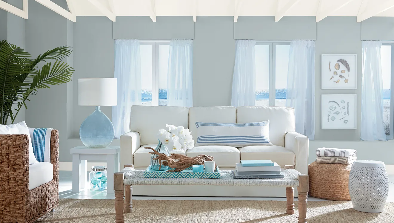
So if you’re ready to get a little more creative with your beach house…

DO: Consider a color palette beyond blue and white :)

Or at least add one more color to the palette: light green, yellow…even red if you’re patriotic. I happen to love red, white and blue together.

I recently proposed a lavender and green palette for a client’s Nantucket house. (If you ever sneak a peek at your teenager’s or young adult’s phone, you can see my TikTok about that project.)
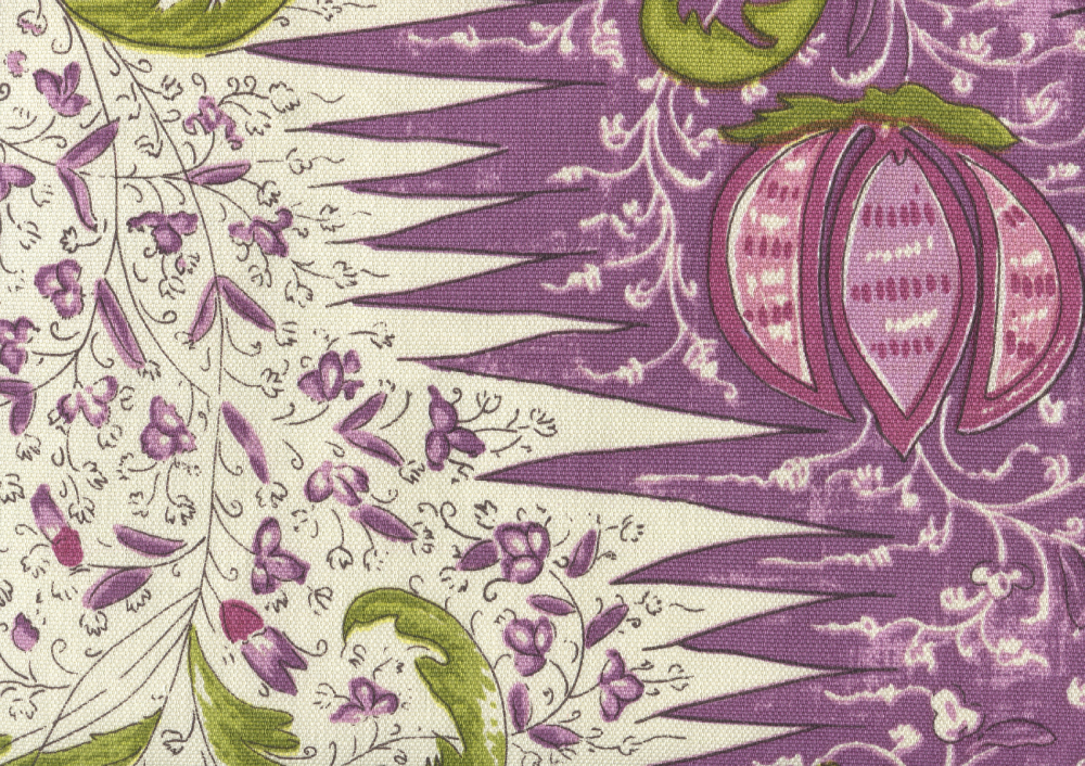
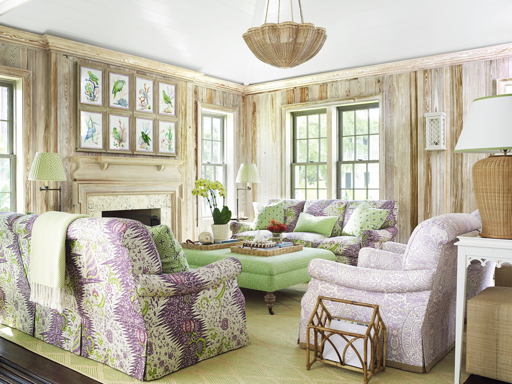
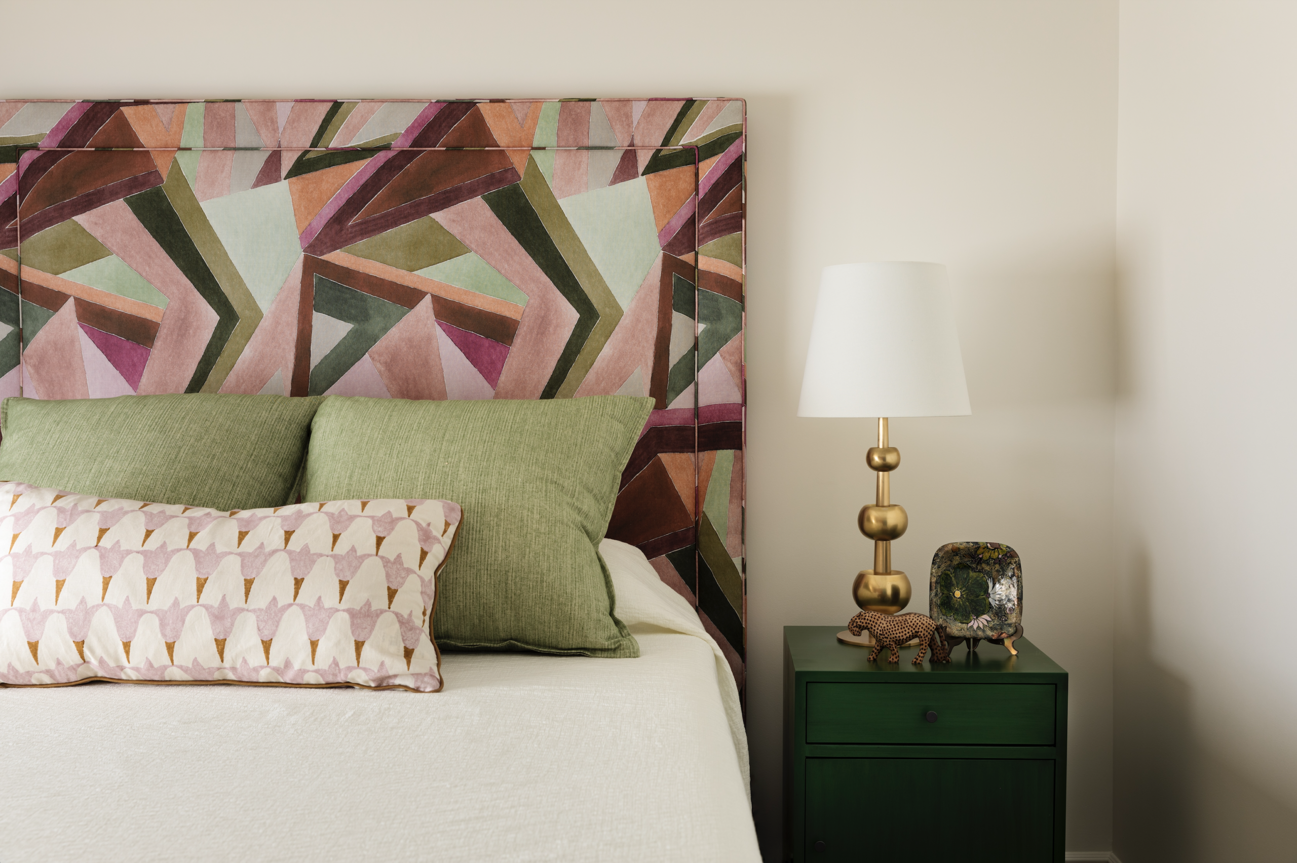
Quadrille’s Les Indiennes – Multi Lilac Plum Green
From Amanda Lindroth
Purple, green and pink bed frame, green beside table.
Photo by Trevor B. Parker

The key to making any color palette beachy is keeping the colors light and using a lot of white. You can limit color to the furnishings if you like; white walls are great.
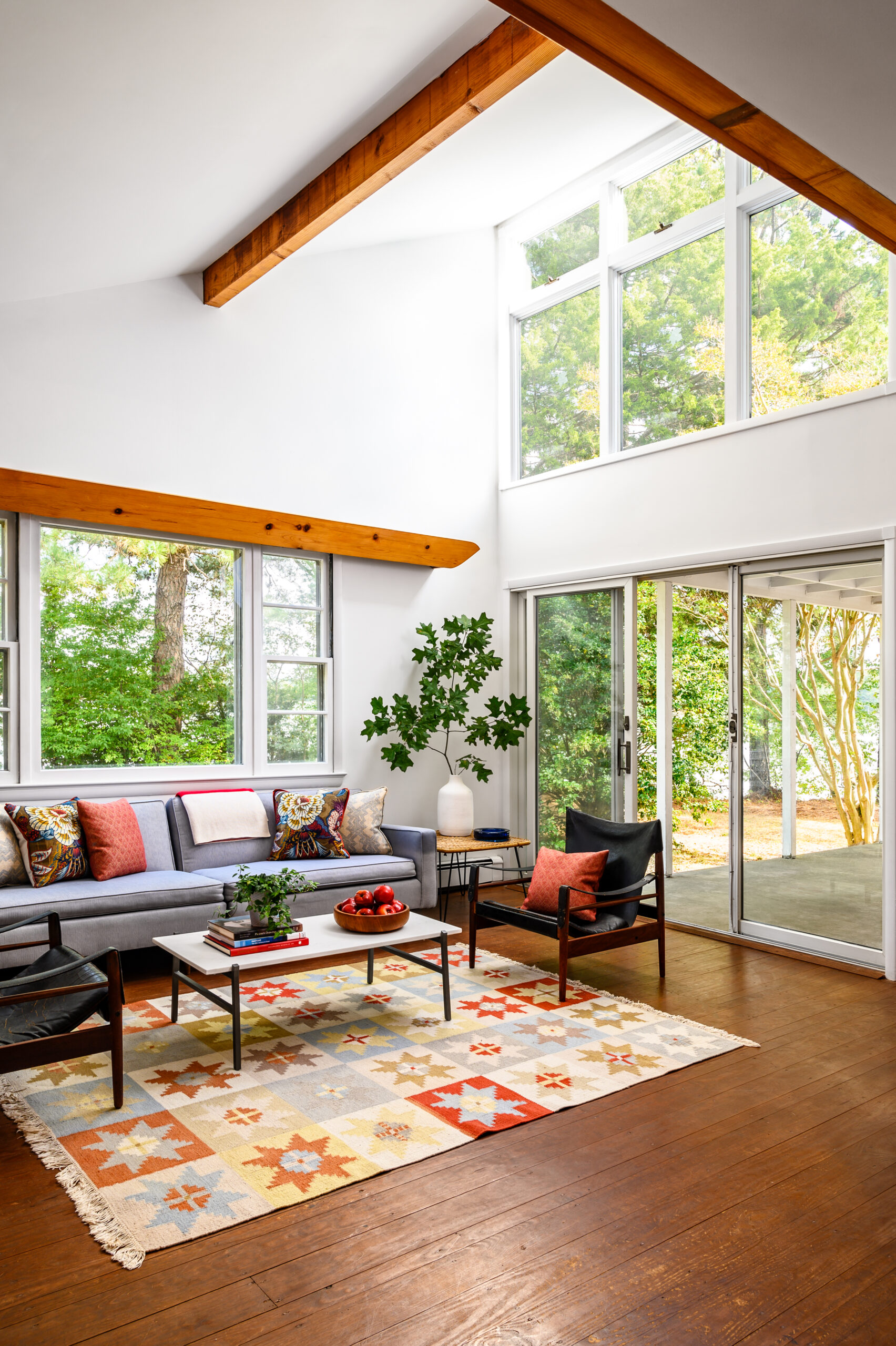
Colorful living room with high ceilings and many windows.
Photo by Markus Wilborn

In addition to a light color palette, a key to creating a beachy vibe is using lightweight fabrics such as linen and cotton for your upholstery and window treatments. (I probably didn’t even have to say that; it’s intuitive.) No velvet or chenille, no wool, no boucle – even if it’s white.

DO: Use pattern!

Have you noticed that most aspirational pictures of beach houses use SOLID white and SOLID navy? Sure, maybe there’s an occasional blue and white striped pillow, but there’s certainly very little plaid or floral. Please think about that. In your new colors ;)

DO: Limit the number of seagrass rugs.

Seagrass rugs are popular in beach houses for a reason. They’re durable, the natural material is found near beaches (SEAgrass), and the color is neutral. Plus they’re just awesome. I love seagrass anywhere, and I’m certainly not going to snatch it out of your beach house.
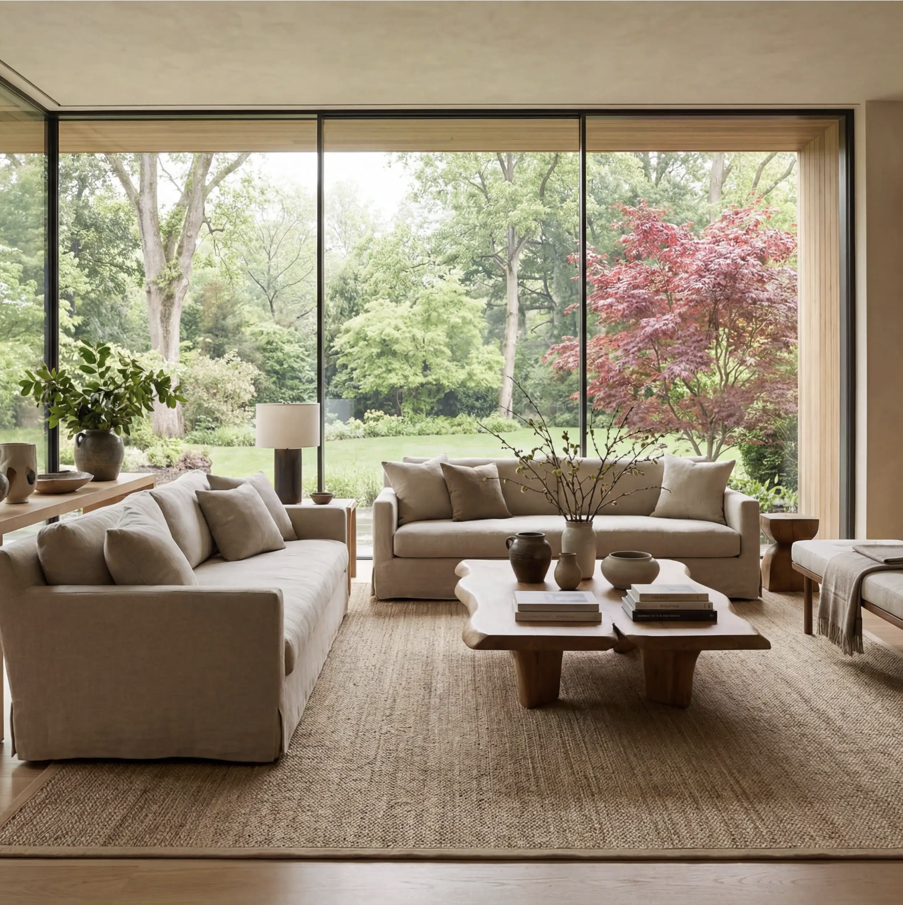
Beige furniture on seagrass rug.

Might I suggest, though, that you use a seagrass rug as a layering piece? Place a large seagrass rug under all of the furniture in your sitting area and then put a smaller, flat rug in the center. You get some color in there and add interest.
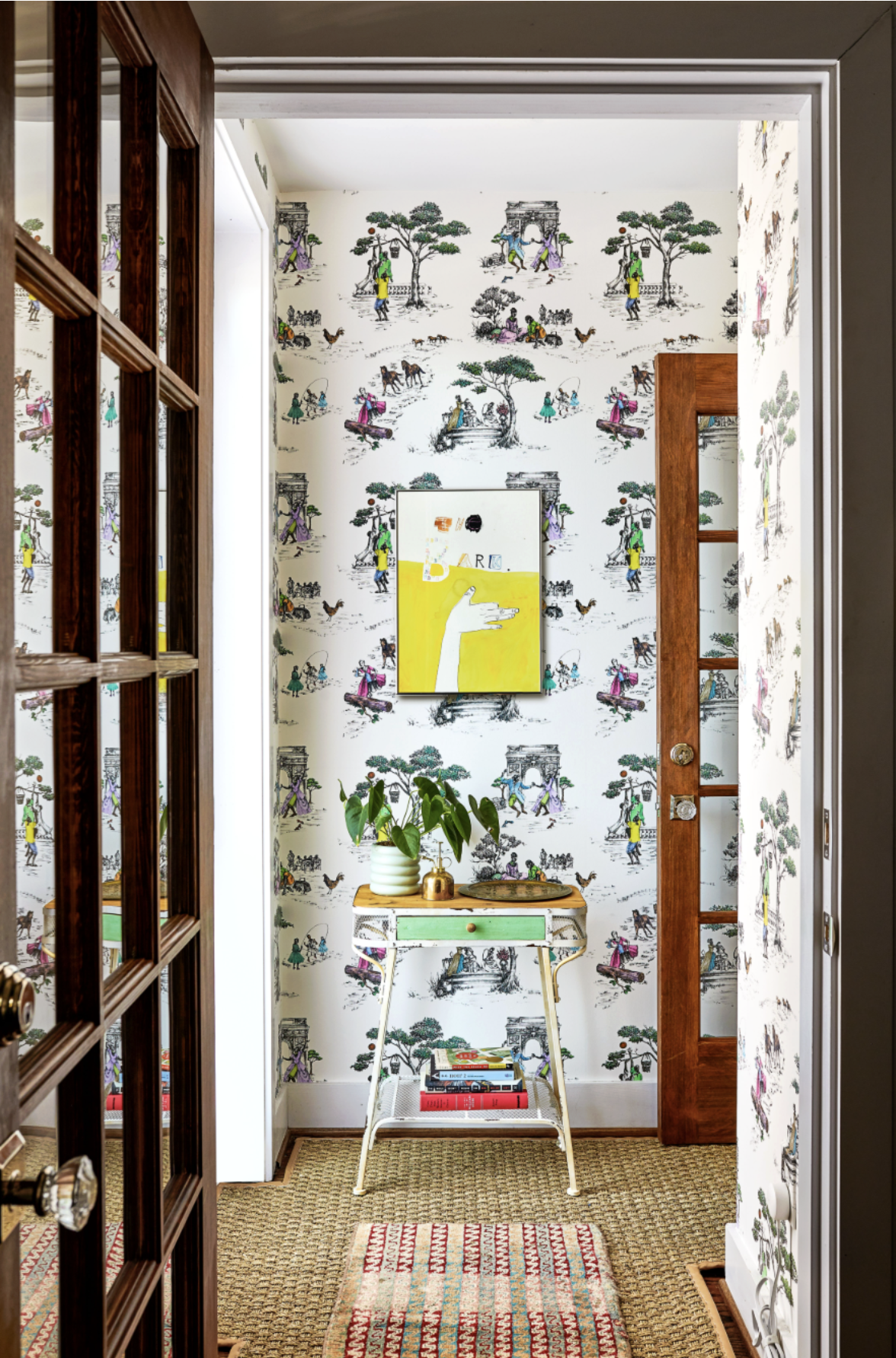
Hallway with layered rugs and whimsical wallpaper.
Photo by Stacy Zarin Goldberg

So use seagrass it in your entry, or maybe in your sitting area, but for a less predictable beachy look, don’t use it in every room.

Speaking of grasses… If you have a room with a seagrass rug, no natural woven Roman shades, please. It’s like putting too many different animal motifs in one room: too much of a good thing. (Not to disagree with Mae West, but…)

Other ways to make your beach house less beachy:

DON’T: Overdo beach-themed decor. Be strategic. I will never deny you kitsch in small doses; I myself have a painting or two of oyster shells. But to make your house look more original and less predictably beachy, here are my thoughts.

Words are fine on pillows, less awesome on walls.

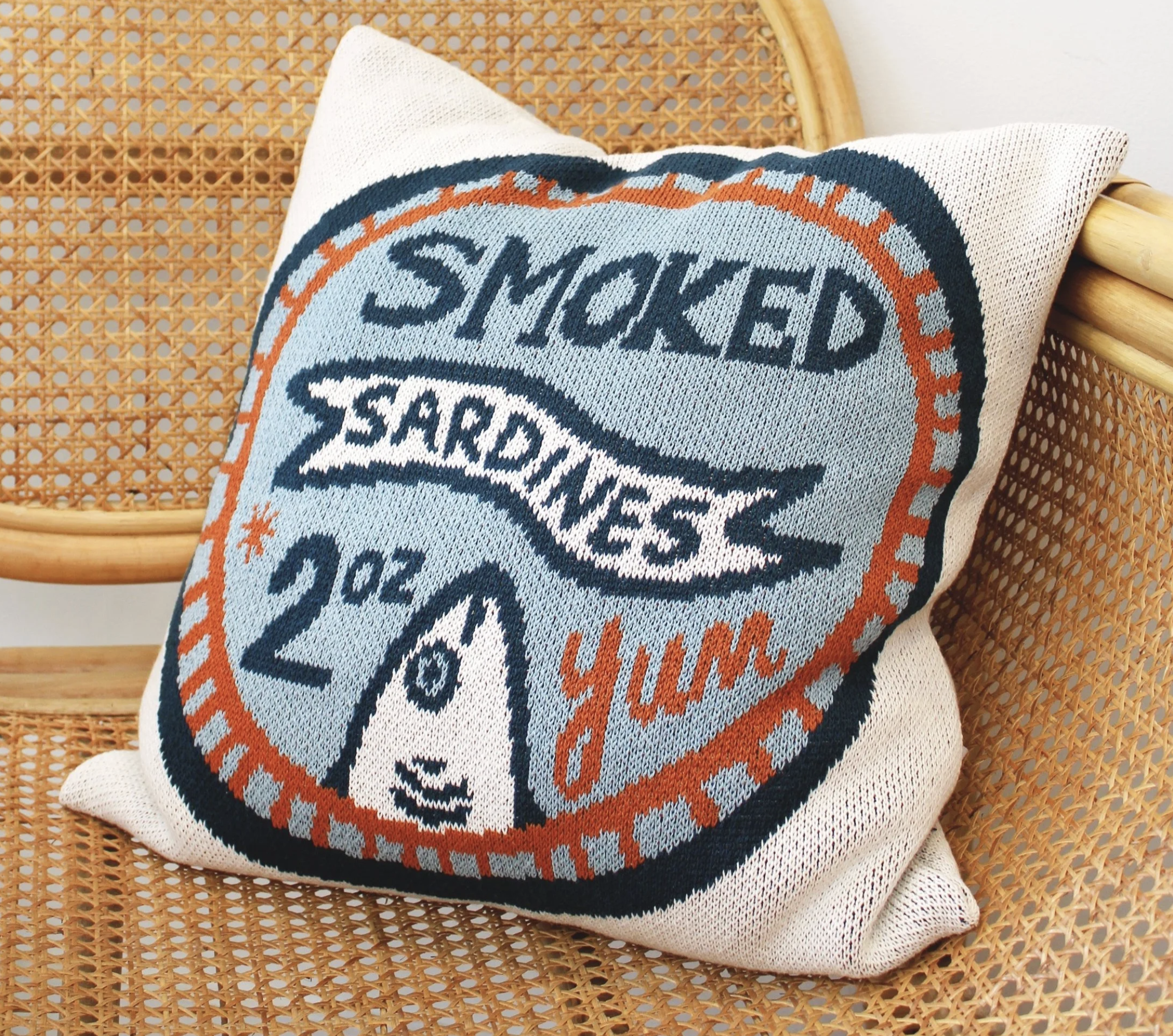
So pillows, yes:
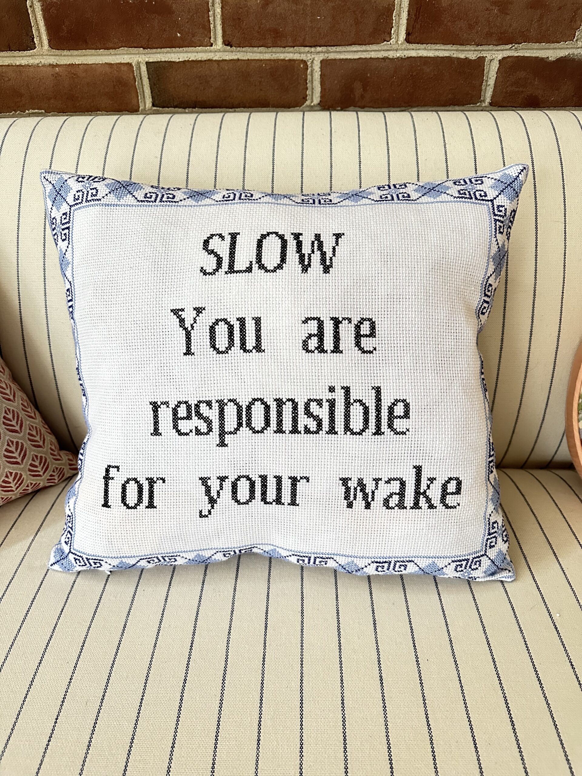
Pillow that says "SLOW. You are responsible for your wake."
Pillow with a sardines ad.

But words on wall, no. (For more on this subject, please see my “Words as Art” blog post.) Can we please agree never to use these signs again?
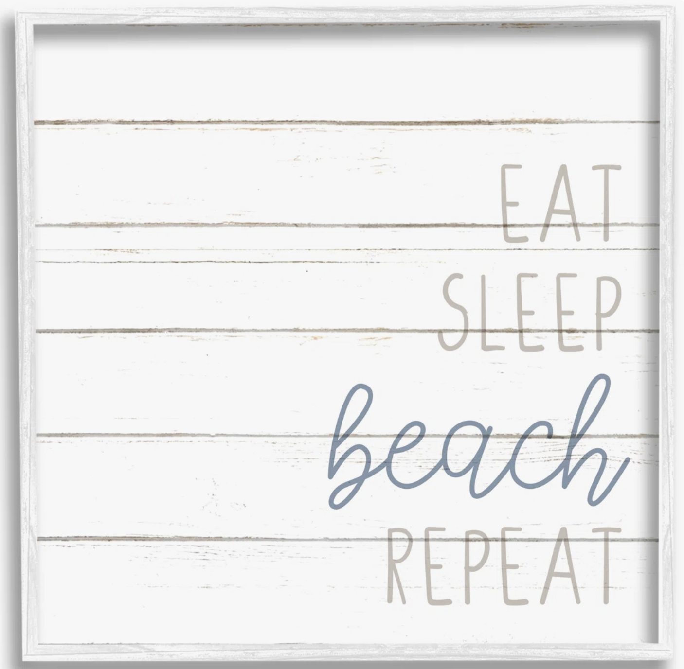
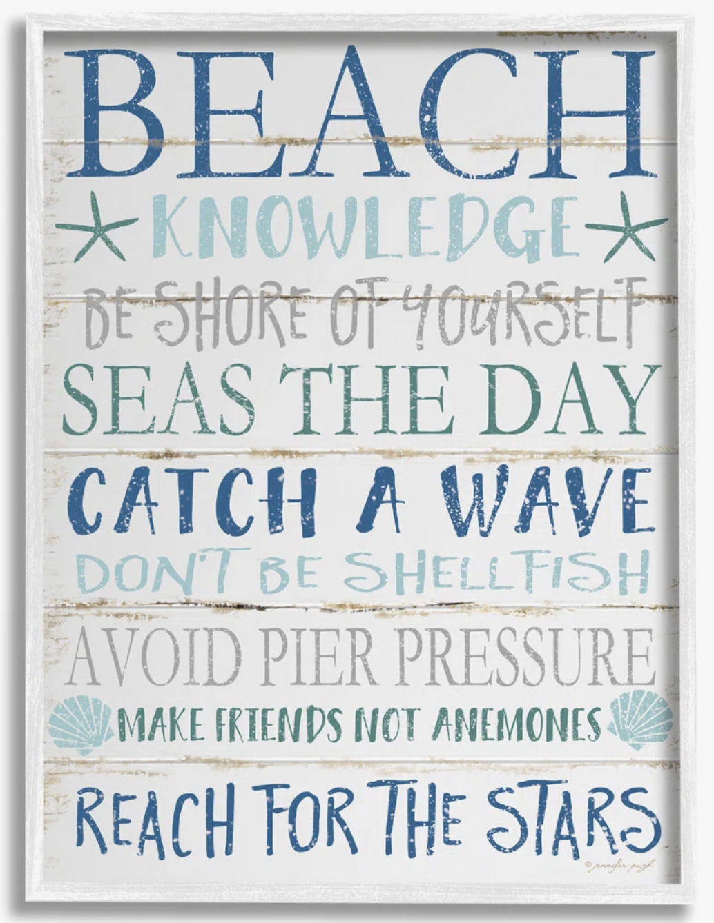
Eat sleep beach repeat wooden sign
Beach knowledge sign on wood

I’ll give you a pass on signs with the specific name or coordinates of the island or town. I don’t know why, but I think those are cute.

DON’T: Overdo the beach-themed art.

Delving further into things you hang on your walls, integrate beachy art (or vaguely beachy, as I’m considering the blue and white pieces below to be) with other artwork.
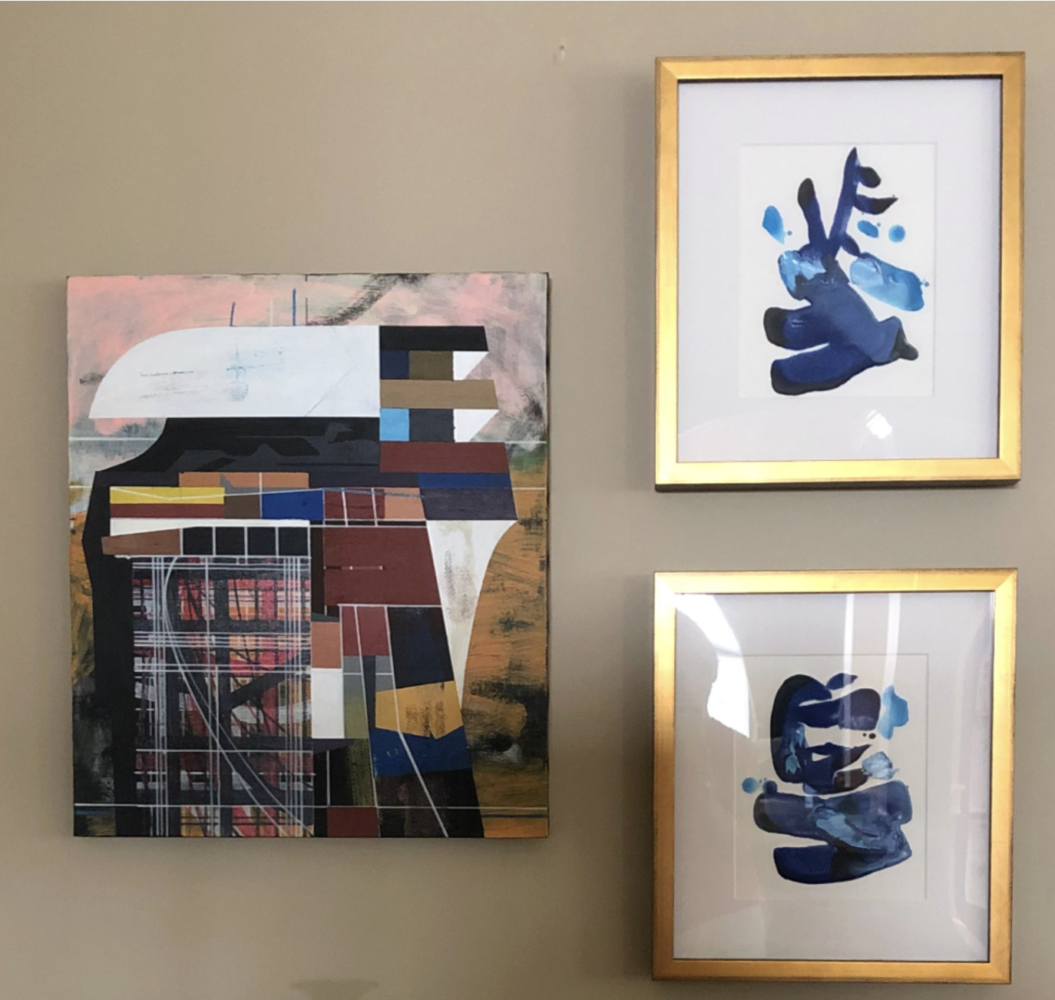
Three pieces of art. Two of the three are blue and white.

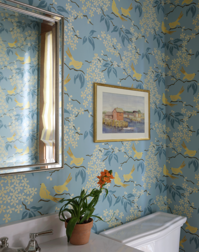
And/or use original art,

Painting of seaside hanging on bird printed wallpaper.
Photo by Angie Seckinger

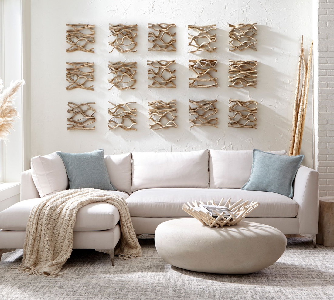
Please do not do this:

Driftwood art on wall

and please do not even think about a pre-fab, themed gallery wall unless you want your house to look like a second-rate hotel.
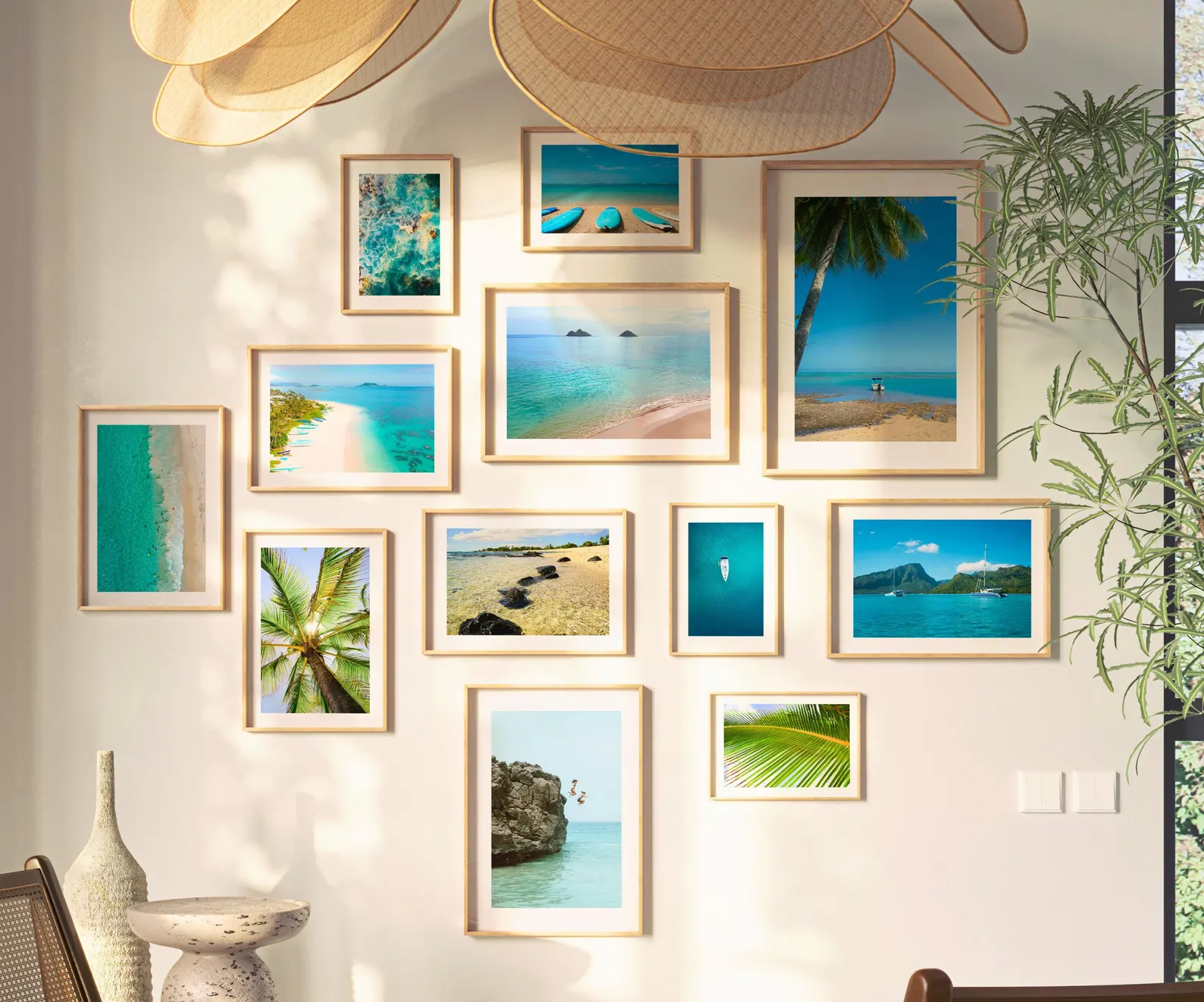
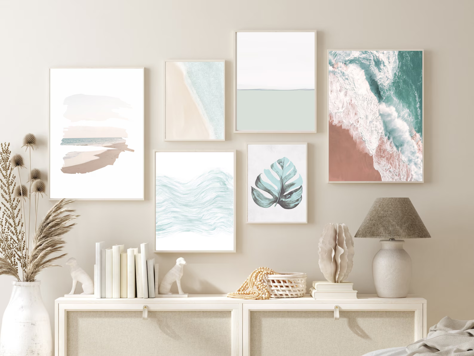
Gallery art wall of beach photographs
Gallery wall of beach themed art

DO: Be strategic with decorative items.

Seashells have their place, and that place is in a bowl, preferably a glass bowl. I’ll also allow shells grouped on a mantel or tabletop. (Strength in numbers.)

I’m less enthusiastic about seashells being used like this:
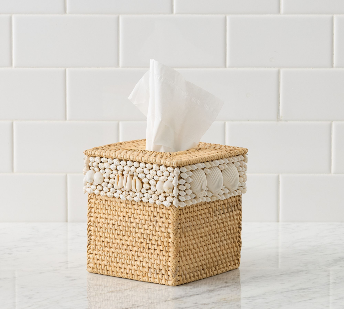
Kleenex tissue box decorated with shells

Beach-themed food-related items are fine. Trays, tumblers, dishes…they’re not on view all the time. And in the case of cocktail napkins, they’re disposable.
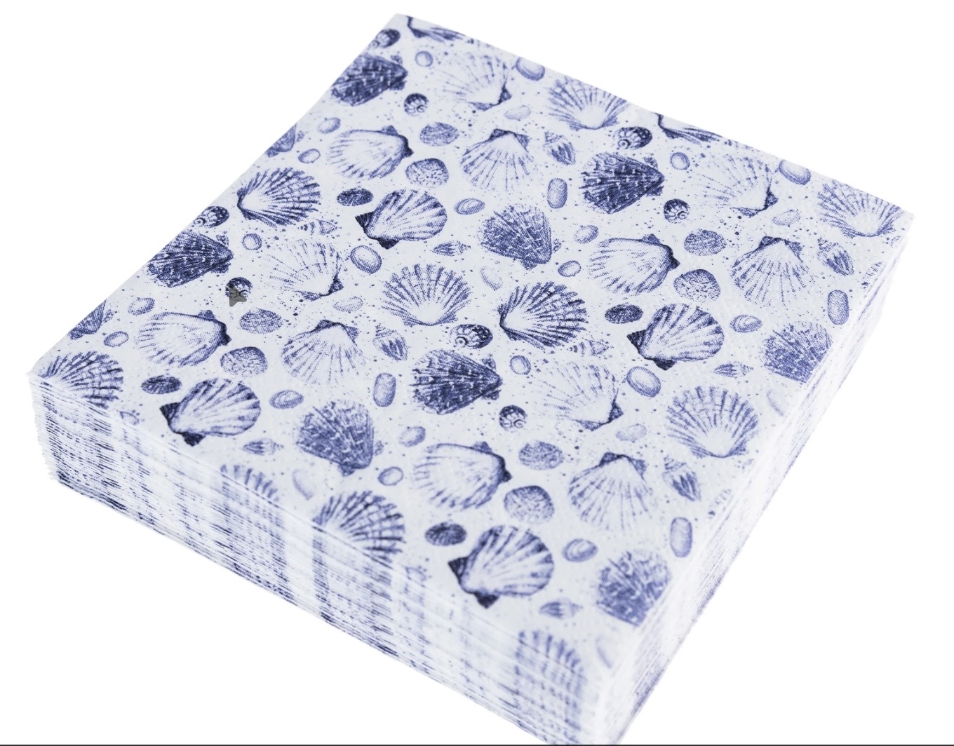
Stack of cocktail napkins with shells on them

Finally, ditch the sea glass. It’s a controversial position, I know, but I hate sea glass. (It’s two words; I had to look it up.
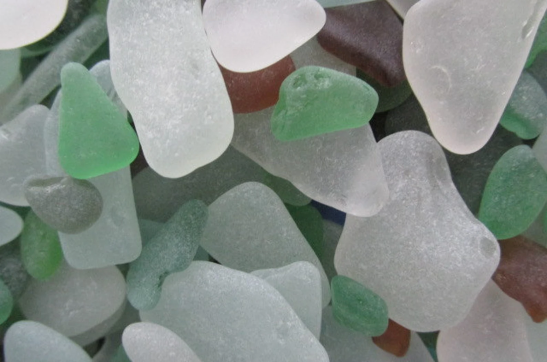
Sea glass pieces

It’s trash that’s been weathered by nature. What’s the appeal?
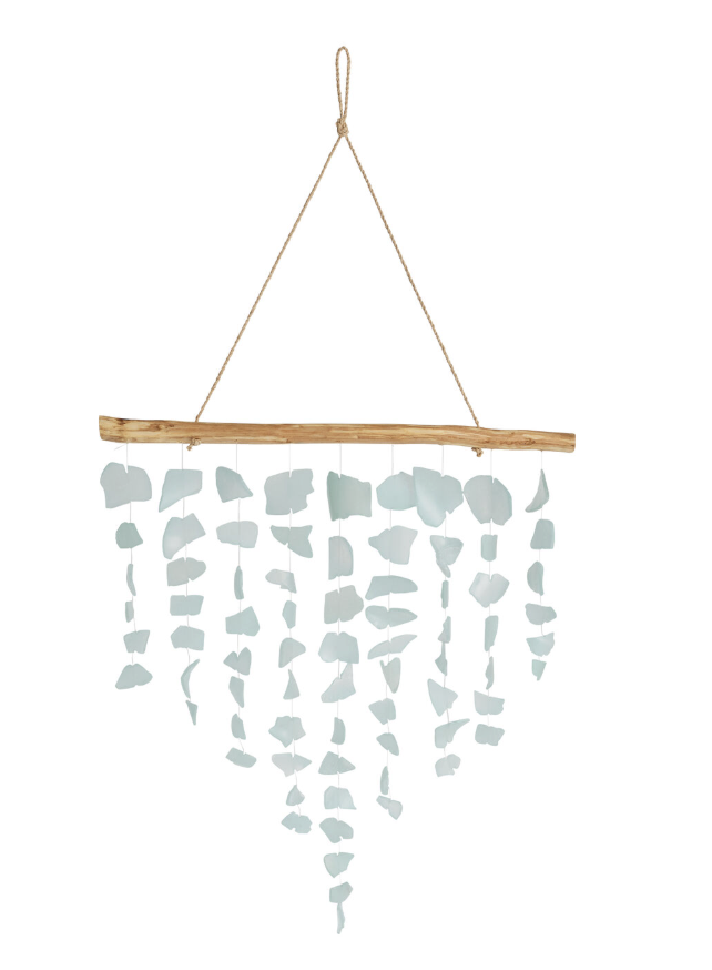
Mobile made of sea glass

For those of you who LOVE sea glass — I hear you cursing my name! — there is a Sea Glass & Coastal Arts Festival at the St. Michaels Maritime Museum every April. If you see me there, I’ll be in the “oyster art” section. You’re just in time for the 2026 festival in Lewes, DE, though; it’s on June 8-9.

If you MUST collect sea glass, put all of the pieces into a bowl and call it a day.
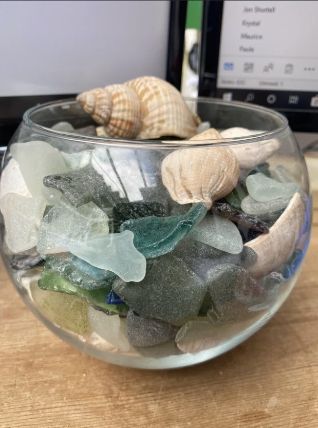
Bowl of sea glass pieces

As always, these are recommendations, Gentle Readers! Do with them what you will, and I hope your summer is off to an amazing start.

Annie Elliott Design is a Washington, D.C based firm, but we also love working in NYC. We especially love beach houses :) . We’re now scheduling projects for the summer. Please contact us to discuss.

Category: How-toTag: Beach, beach theme, Coastal, color palette, costal decor, country house, Nautical, sea glass, Summer, summer house, weekend house

Sidebar

Subscribe


Bossy Color Blog

Categories

  • Art + accessories »
  • Bedroom »
  • Color + paint color »
  • Dining room »
  • Furniture + upholstery »
  • Kids »
  • Kitchen + bath »
  • Lighting »
  • Living Room + Family Room »
  • Renovation »
  • Rugs »
  • Wallpaper »
  • Window treatments »

View Portfolio

view Bossy Color's portfolio

Instagram

annieelliottdesign

View Instagram post by annieelliottdesign

Aug 27

Open post by annieelliottdesign with ID 18339370936281789
SO much fun to create this entertainment space! This client already had a living room and kitchen…this space is for friends and family to relax, talk, and just BE. What’s your favorite feature?

annieelliottdesign

View Instagram post by annieelliottdesign

Aug 26

Open post by annieelliottdesign with ID 18618812233051872
Happy Wallpaper Wednesday! There’s no better paper to feature in August than Schumacher’s Citrus Garden 🍋 🍊.The Swedish designer, artist, and architect Josef Frank created the Citrus Garden pattern as a fabric in 1947. The hand-drawn, whimsical, quintessentially mid-century, irresistibly cheerful design exemplifies Frank’s philosophy: “The freer the pattern, the better.” I’ve used Citrus Garden fabric a few times, but shockingly, the pattern wasn’t on wallpaper until 2017!! 🤯 Deprived for so long!! As soon as the opportunity arises, I’m running, not walking, to get my hands on this wallpaper.@schumacher_midatlantic 📸 @angieseckinger

annieelliottdesign

View Instagram post by annieelliottdesign

Aug 19

Open post by annieelliottdesign with ID 17979208500097924
All of a sudden, novelty accent lamps are EVERYWHERE! Some are cute, some are…inadvisable ;) If you just can’t resist a lamp in the shape of a snail, my latest blog post has recommendations for proceeding responsibly💡

annieelliottdesign

View Instagram post by annieelliottdesign

Aug 12

Open post by annieelliottdesign with ID 18109874522009739
Happy Wallpaper Wednesday! Let’s talk about Cole & Son’s Acquario, shall we?Iconic Italian artist Piero Fornasetti designed Acquario for Cole & Son in the early 2010s. He was going through an ocean phase, captivated by its mysterious depths 🐠, so he developed this fish design and put it first on plates and fabrics, and then, luckily for us, on wallpaper. We just installed Acquario in the Print Room Blue colorway in a client’s tiny practice room (he plays classical guitar), and we LOVE it! That big old blowfish, just gliding along…he kills me.Featuring: @cole_and_son_wallpapers @fornasetti

annieelliottdesign

View Instagram post by annieelliottdesign

Aug 9

Open post by annieelliottdesign with ID 18436273279134156
Green, light blue, and a touch of navy come together to create a room that's bright, welcoming, and incredibly summery 🥰 🥰 🥰 #interiordesign #summercolors

annieelliottdesign

View Instagram post by annieelliottdesign

Aug 7

Open post by annieelliottdesign with ID 18065703698744445
Given that my brain is still on an academic calendar 🤷‍♀️ , I thought I'd do a little review and see which blog posts resonated with you the most in 2025-26. Who knew that a post from 2011 (!!!) is still in the top 5! Click over to the post to to see the year’s greatest hits. #interiordesign #designinspo

annieelliottdesign

View Instagram post by annieelliottdesign

Jul 24

Open post by annieelliottdesign with ID 18007861235943398
Get ready for a dramatic before and after! We transformed a playroom into a dining room, and the result is pretty amazing. (But still fun!) #wallpaper #interiordesign #diningroominspo

annieelliottdesign

View Instagram post by annieelliottdesign

Jul 22

Open post by annieelliottdesign with ID 18113978008731617
For today’s Wallpaper Wednesday, we discuss the chinoiserie wallpaper in the Great Hall at  @citytavern_dc  in Washington, DC. Ooooohh - field trip!I was delighted to visit City Tavern recently. It’s a historic 1796 Federal building in the heart of Georgetown, and all the cool kids hung out there. You know, George Washington, Thomas Jefferson…those guys. At one point, the building boasted the largest room in Washington.I, of course, was captivated by the Great Hall, which is covered in @graciestudio hand-painted wallpaper — which was selected by none other than Jackie Kennedy! EVEN THOUGH at that time the building was a club that didn’t admit women. Harumph.The chinoiserie walls are gorgeous from far away, but they’re amazing up close, also: you can see faint brushstrokes left by the painters. Doesn’t that give you a shiver? I love it.

annieelliottdesign

View Instagram post by annieelliottdesign

Jul 21

Open post by annieelliottdesign with ID 17880979779674102
For a recent article in @vogueliving, I was asked how to mix wallpapers — either in the same room or adjacent rooms. I have a few pieces of advice to offer 😊See my latest blog post for more…#interiordesign #designblog #wallpaperinspo
Follow

Looking for something?

Don’t miss a single post


Where classic and modern hang out and drink gin.

  • Instagram
  • TikTok
  • Pinterest
  • Facebook
American Society of Interior Designers Firm Partner

© 2026 · Annie Elliott Design · privacy policy