• Skip to main content
  • Skip to header left navigation
  • Skip to header right navigation
  • Skip to site footer
  • about
    • services
    • team
  • portfolio
  • press
Annie Elliott Design, Washington DC

Annie Elliott Design

Greater Washington DC

  • book
  • blog
  • contact

The Greenbrier resort: mostly great

Annie Elliott | March 8, 2026

I first visited the Greenbrier in 2023, but when a friend asked me about Dorothy Draper last week, I decided I had to bring back this blog post!

It’s ridiculous that I hadn’t been there before 2023, Gentle Readers. The Greenbrier resort in West Virginia.

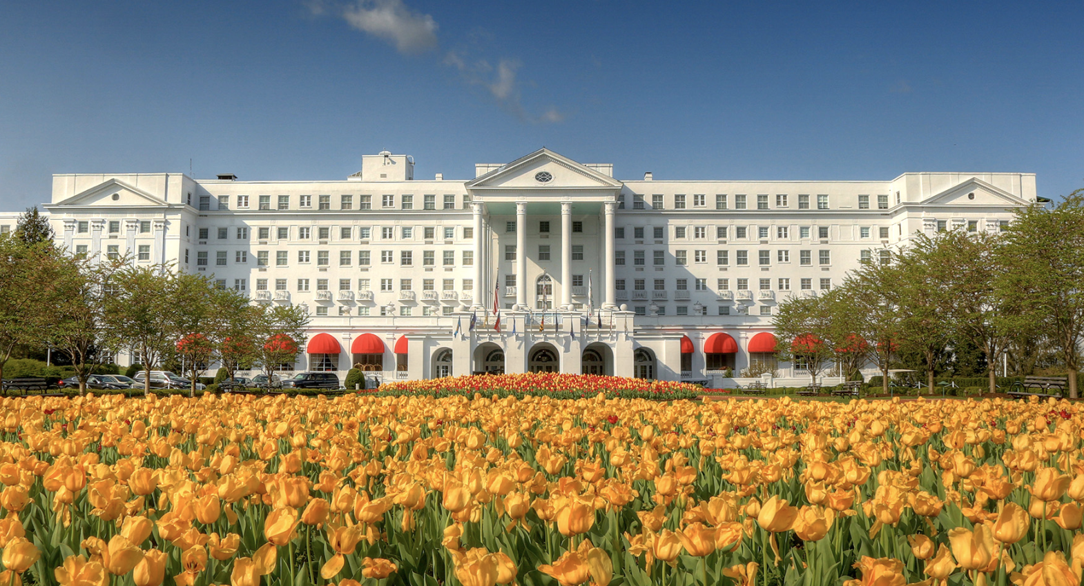
(This picture is from their website. There were no tulips in evidence when we visited.)

Many yellow tulips in front of large white building

The Greenbrier is something of a pilgrimage for interior designers. Decorating doyenne Dorothy Draper ruled the roost from around 1946 until the late ’50s, and the resort is a shrine to her. But I’m not going to give you a history lesson; Carleton Varney’s book Romance & Rhododendrons does that quite well if you’re interested.

Book cover of "Romance and Rhododendrons" by Carleton Varney

Instead, I’m going to focus on, what else? The interior design. You may be surprised to learn that not everything made my love list. But here’s what did.
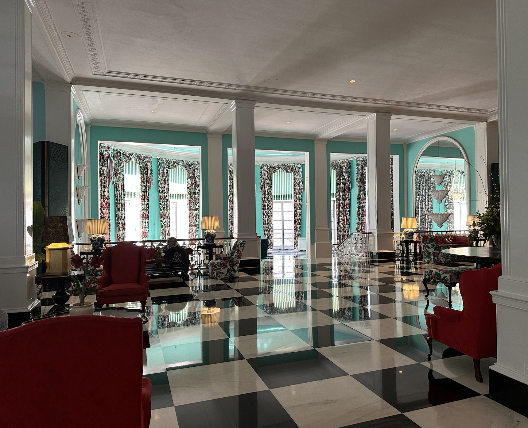
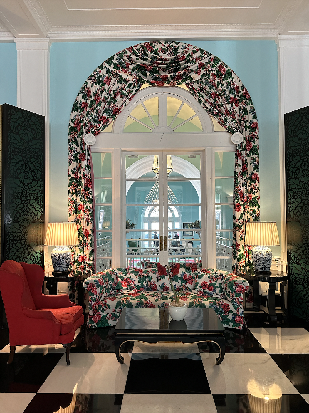
1. The lobby.

The main entrance to the Greenbrier is a fancy split-level.

Colorful hotel lobby

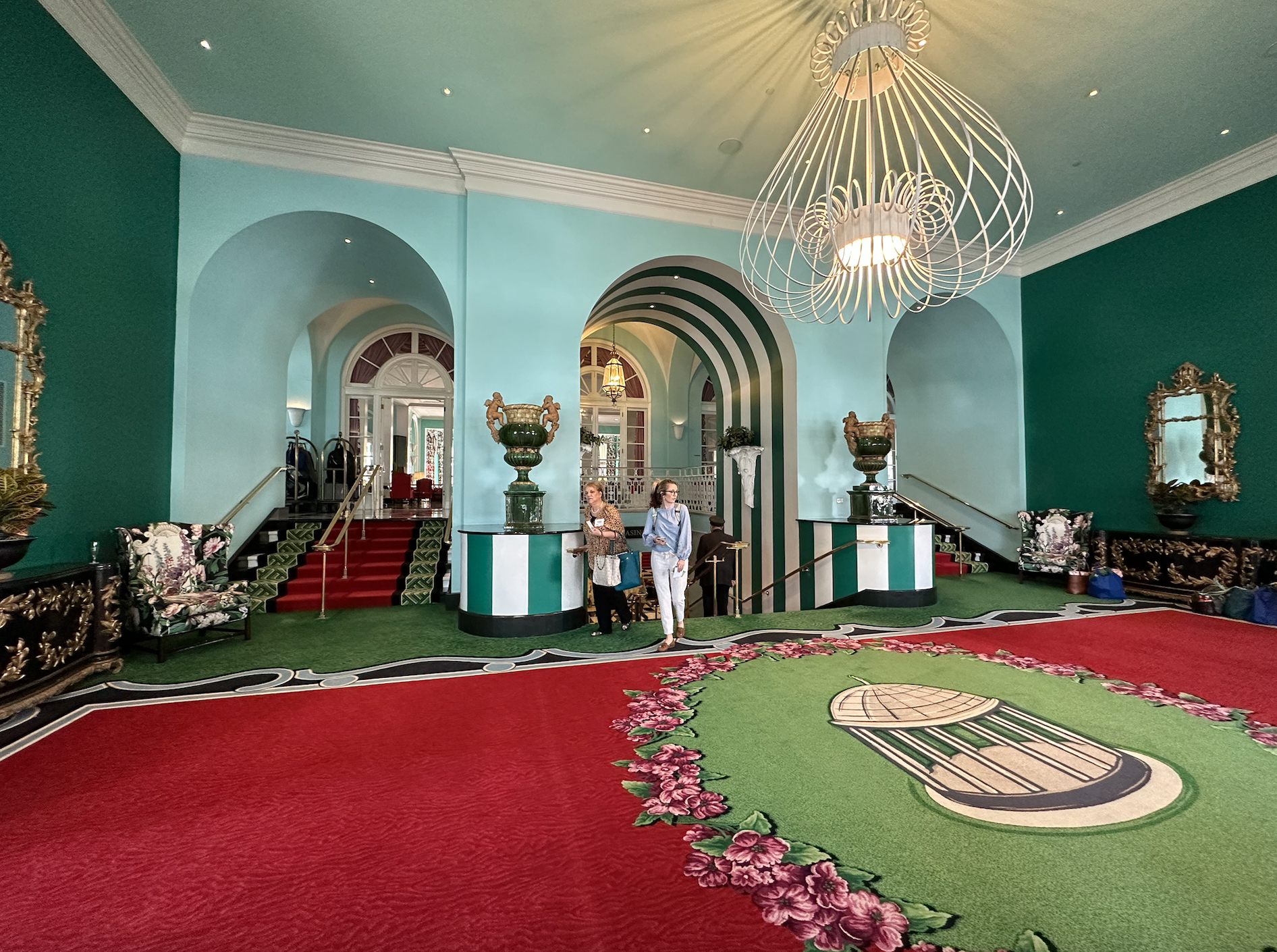
From there, the lobby is up.

Colorful hotel lobby with black and white checkerboard tile

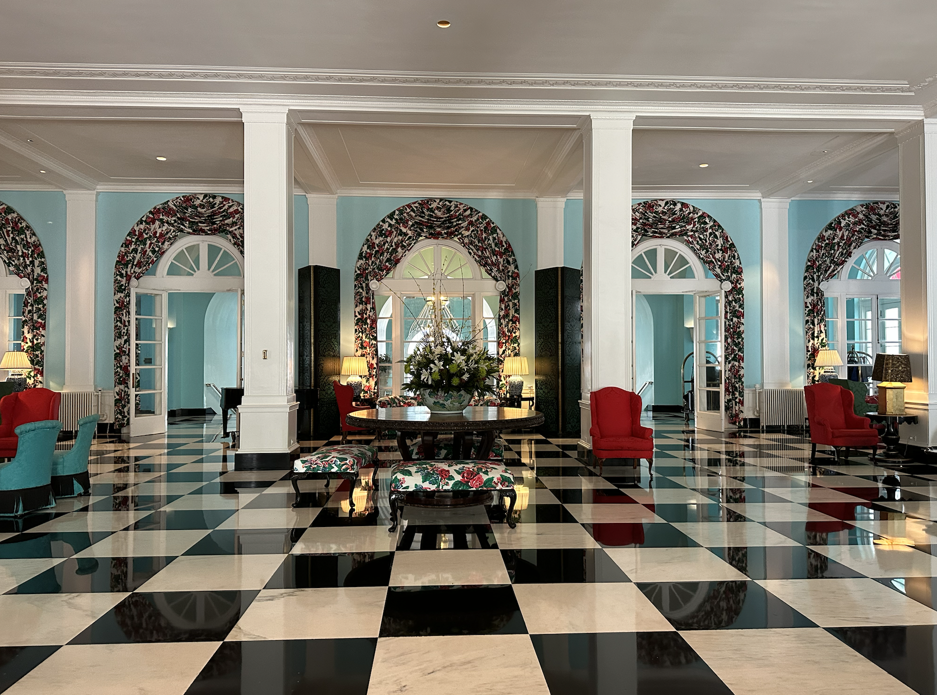
I LOVE — I mean, LOVE — the black and white checkerboard floors (you know that about me), the red and aqua combo, and the vibrant floral chintz. Together. I love it all.

Lobby of Greenbrier

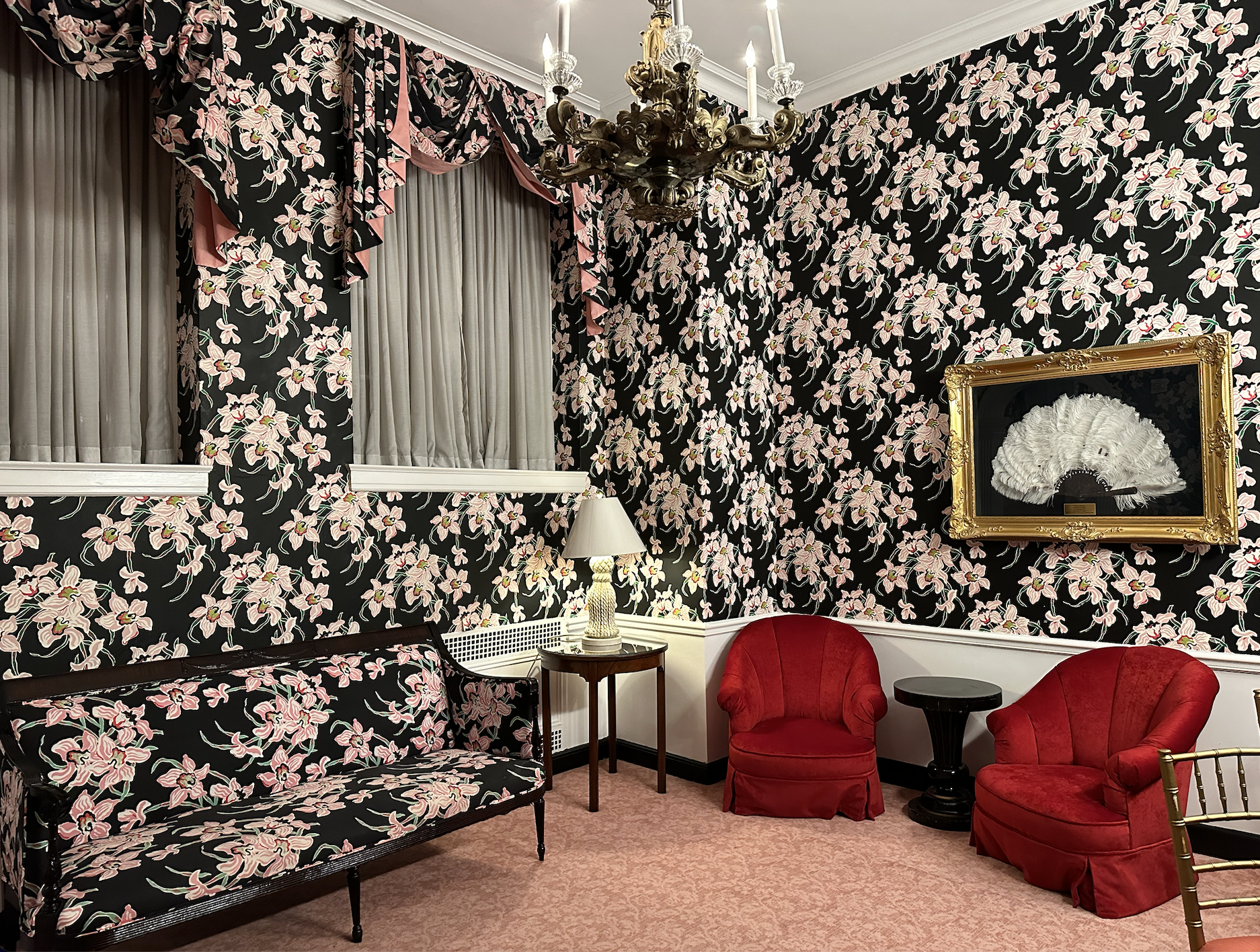
2. The repetition of pattern.

You see it everywhere, but this is a particularly fun example. It’s a ladies’ lounge!

Lounge with matching floral pattern on walls, drapes, and furniture.

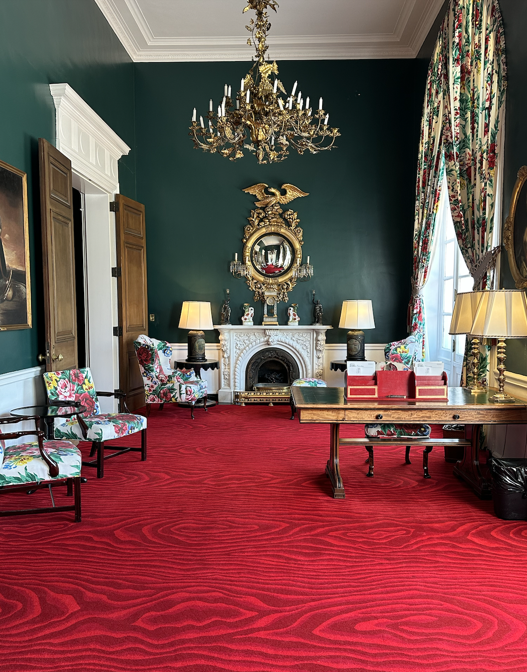
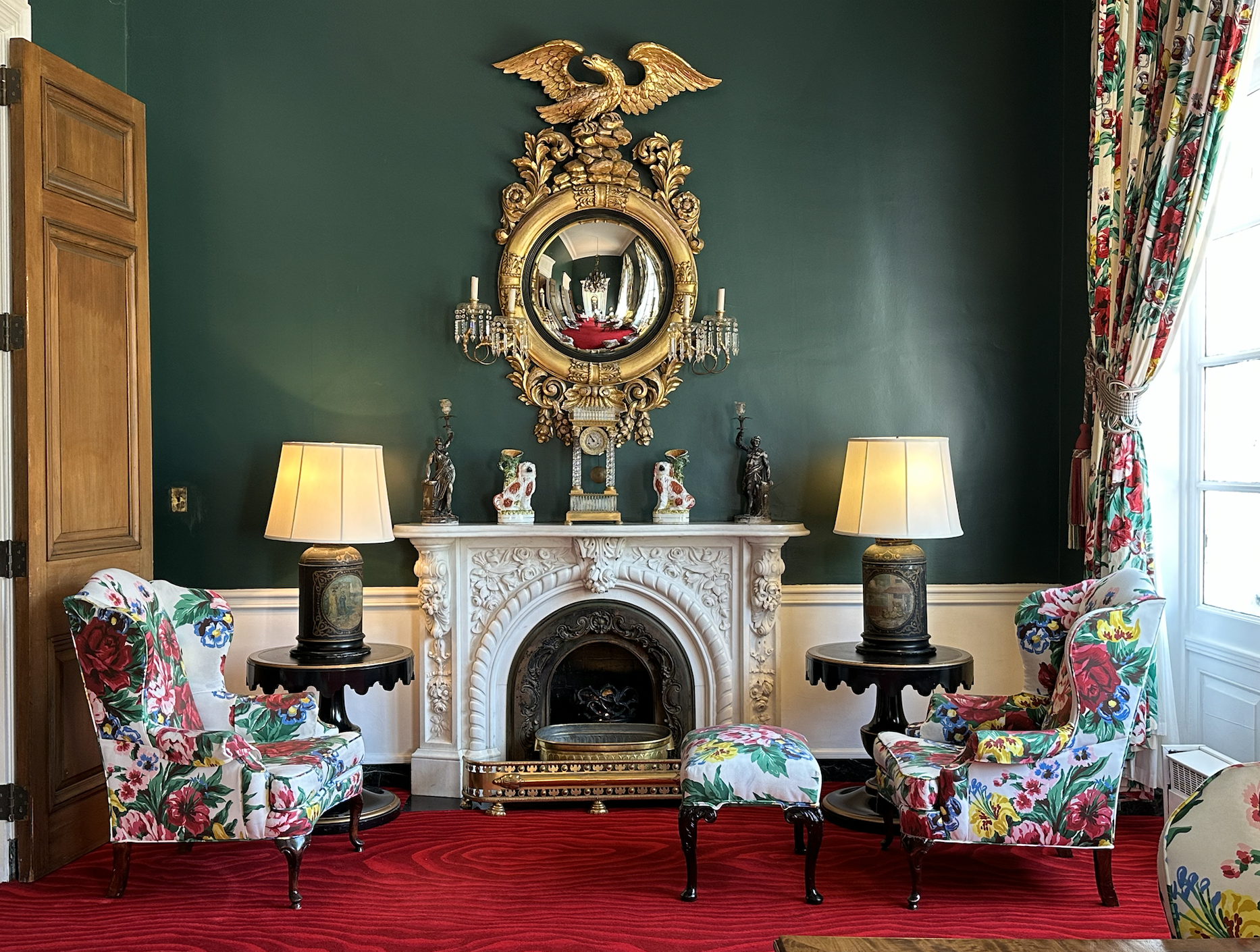
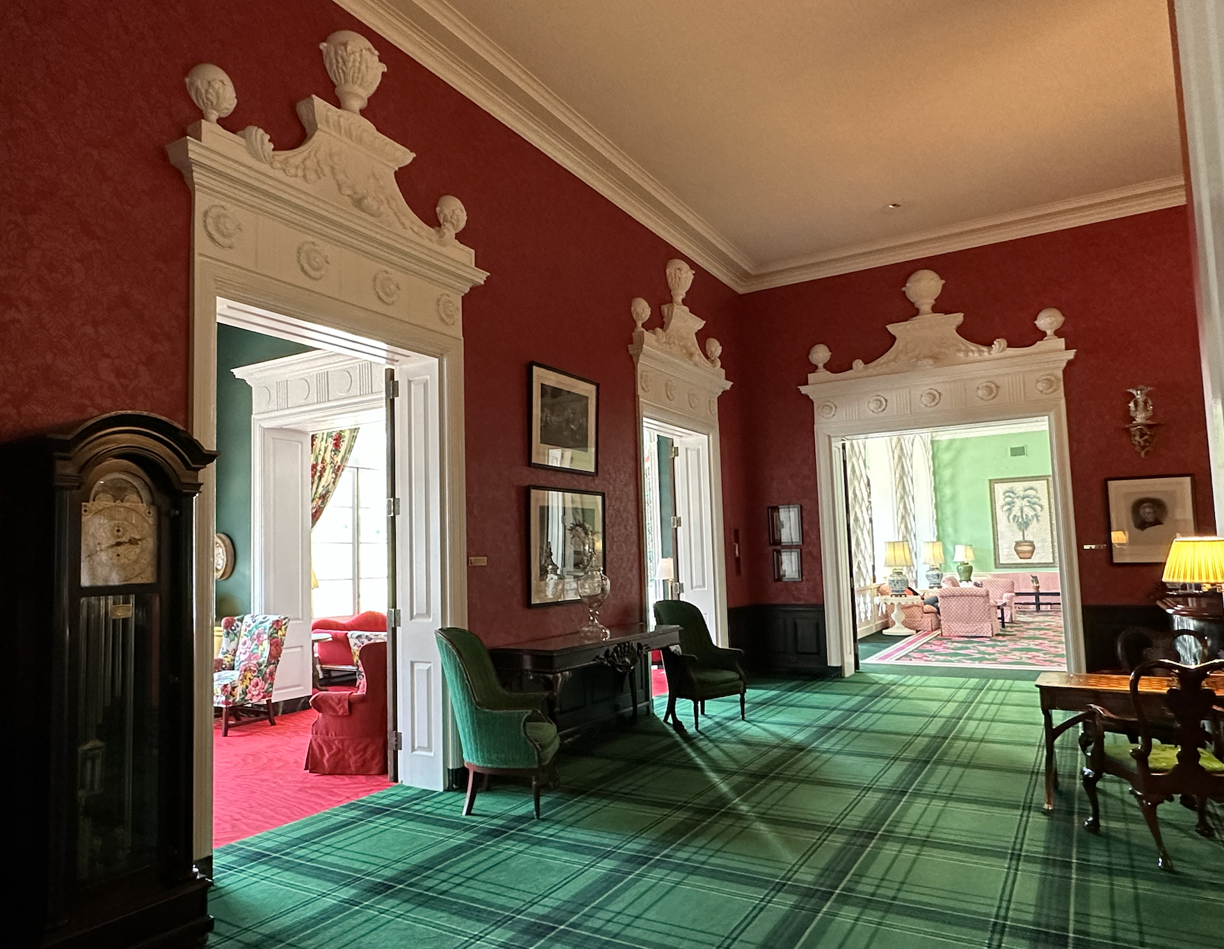
3. The Victorian Writing Room.

A gem of a room. I love red and green together, and the giant faux-bois pattern on the rug is amazing.
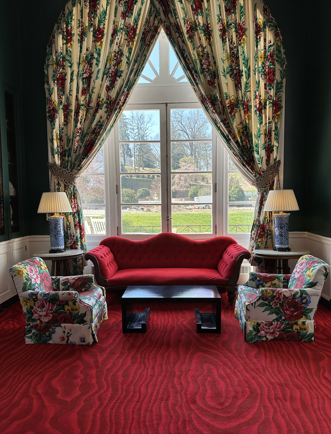
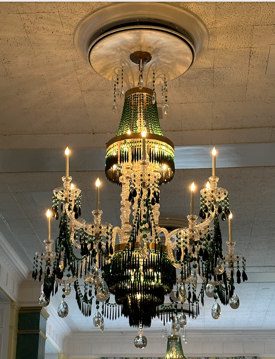
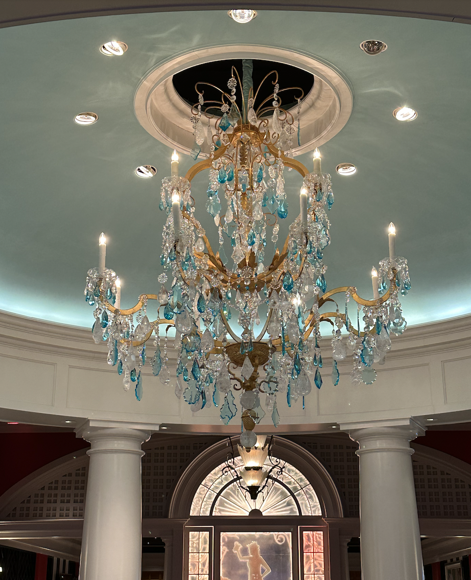
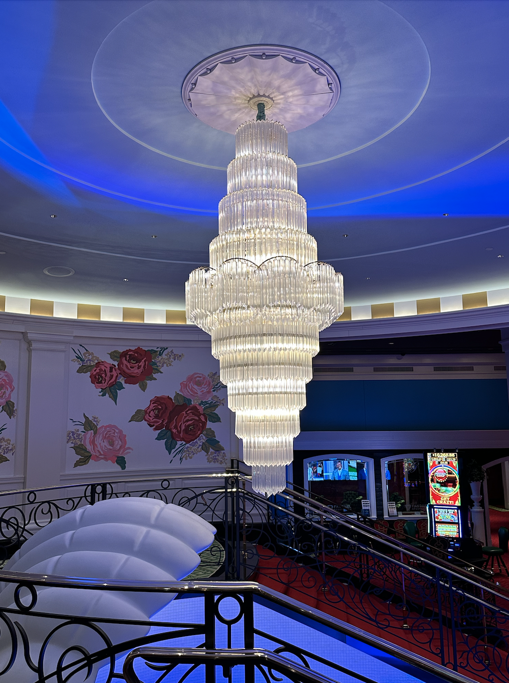
Writing room with green walls and red carpet.
Writing room with red carpet and floral window treatments
Writing room with green walls and red carpet
Red floral upholstery

4. The chandeliers.

Green and white chandelier
White and gold chandelier
Blue, gold, and white chandelier
White chandelier

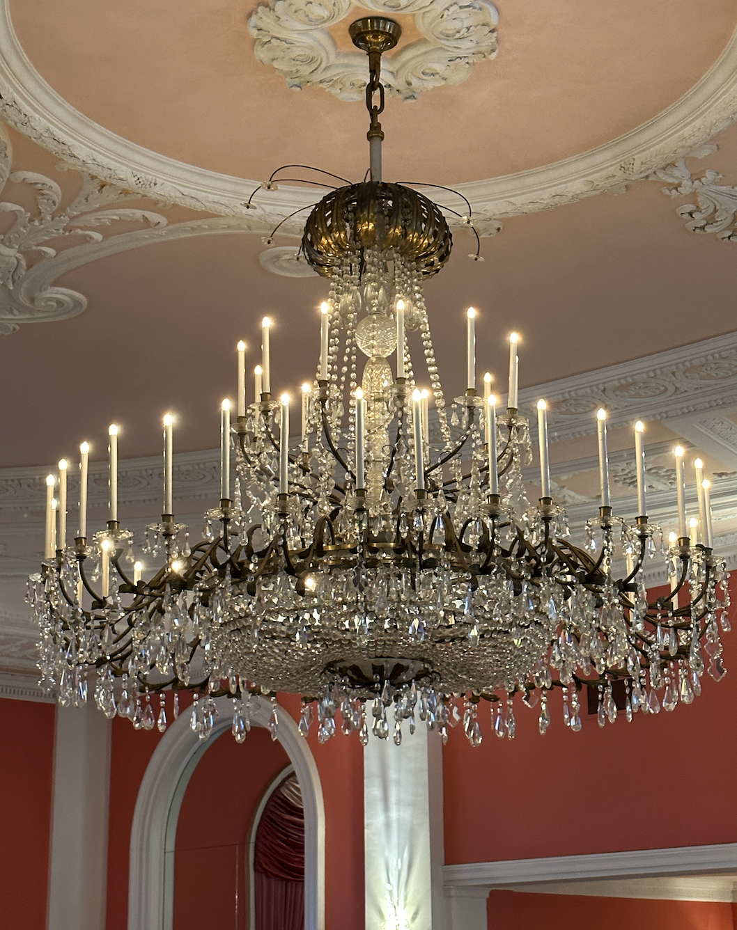
5. The scale in general.

Big. Everywhere. Which leads to more than a few “Alice in Wonderland meets Las Vegas” moments, but for the most part, the huge scale of the spaces and patterns is super fun.

Huge pediments in the Lobby Bar:

Hallway with red walls and green carpet

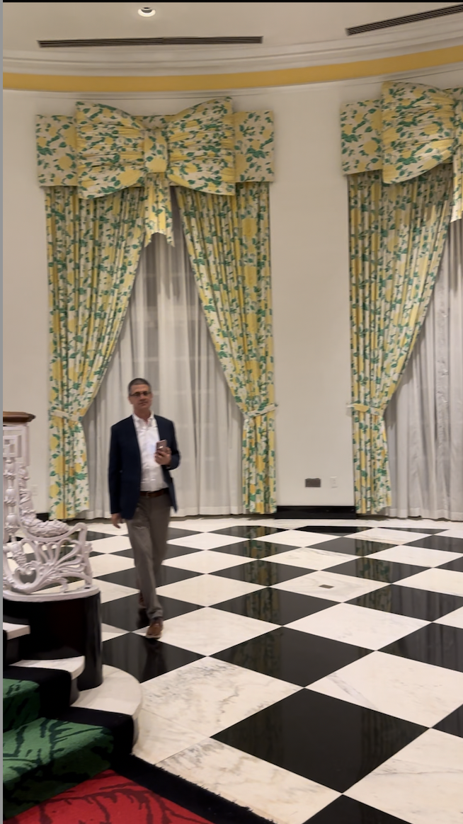
Huge windows…I actually hate the bow/valence concept here, but I’m including this blurry picture of John so you can see just how gigantic the windows are.

Large windows with yellow and green window treatments

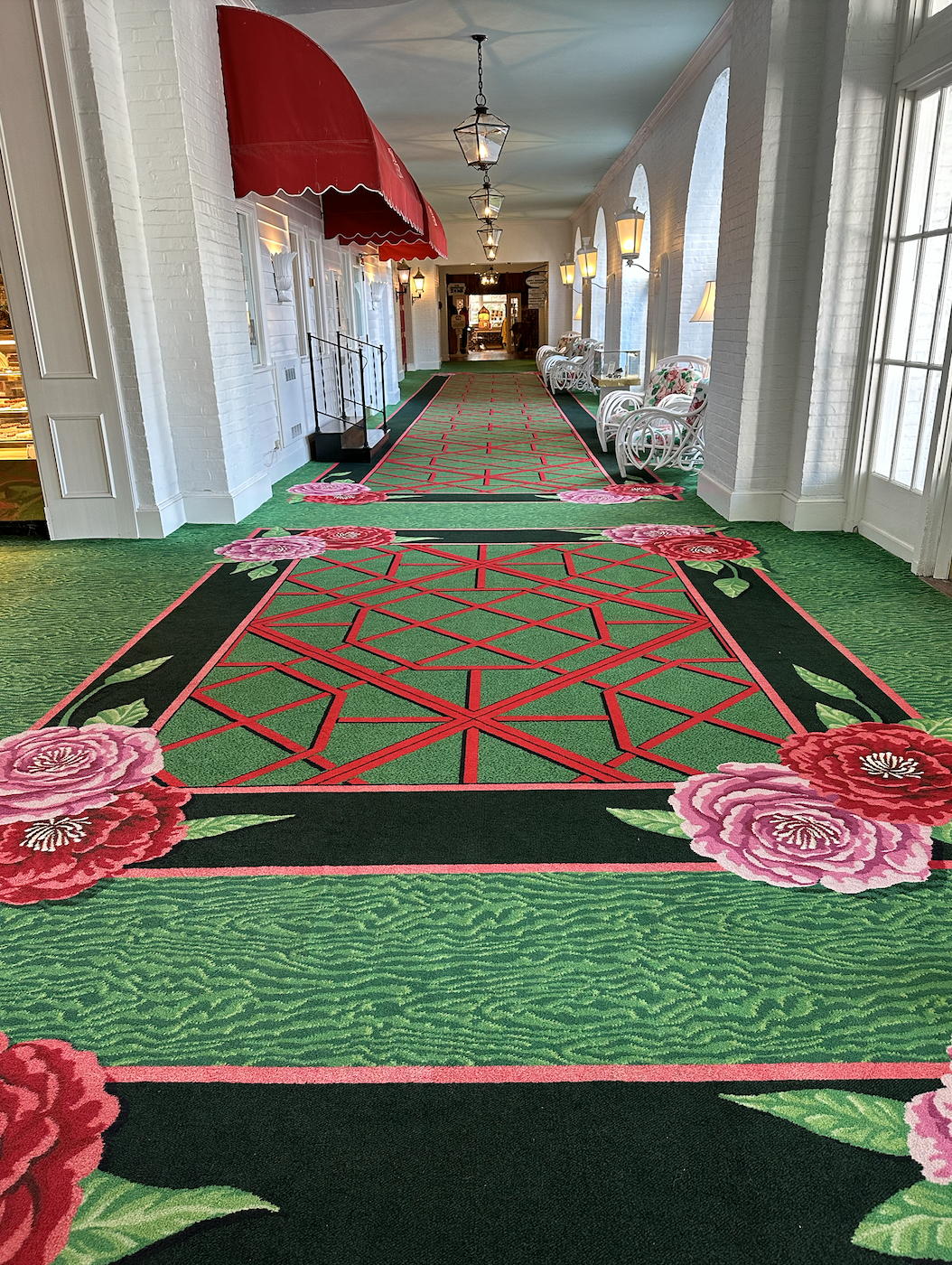
And a huge design on the carpeting in the lower gallery:

Hallway with large scale red, green, and pink carpet

All of that said, I’d be remiss if I didn’t say that parts of the interior design just felt lazy. There’s a whole lotta “Oh, all blues match!” and “Let’s put four random patterns together and see what happens!” Pretty rich coming from me, right? But there were just too many instances in which things looked off instead of whimsical.

For example, what, pray tell, is this weak, powdery blue sofa doing in the drama-filled lobby? Color-wise, it doesn’t hold up in this context.

Colorful lobby

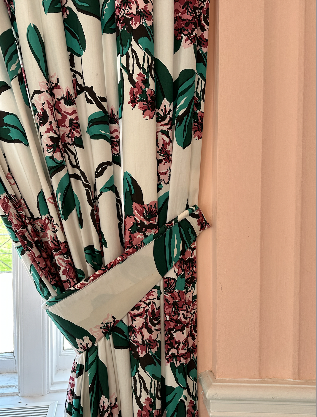
Here, a matchier pink wall wouldn’t make my teeth hurt the way the coral does:

Floral window treatments and pink wall

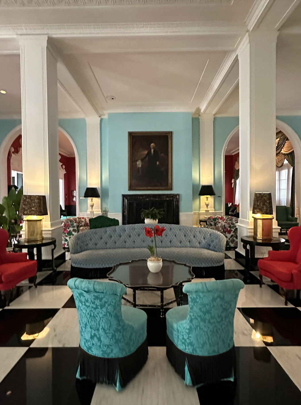
In the “Clock Lobby,” we’ve got all sorts of clashiness going on. The green of the rug has nothing — I mean nothing — to do with the sofa upholstery. Or the teal chairs. And in real life, that minty sofa isn’t awesome with the aqua stripes on the walls.

Blue and white striped wall, blue chairs, mint green sofa, dark green carpet

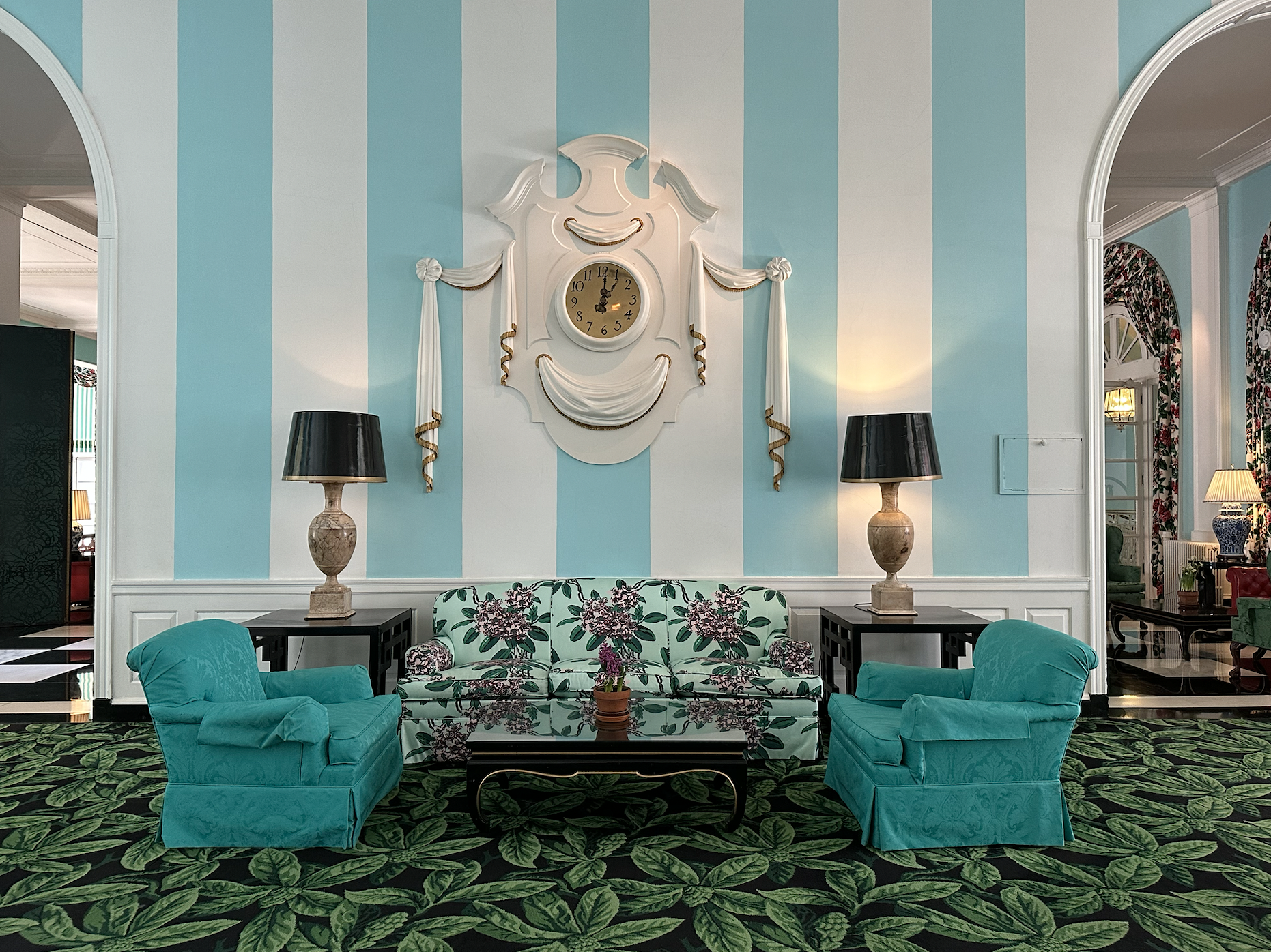
We also have a scale issue here. Those lamps — not joking — are at least 4′ tall. The tables they’re on are appropriate for them. But the tables and lamps together DWARF the sofa. The upholstered pieces are clinging to the coffee table like a life raft, and the tables and lamps and stripes are singing with the architecture. It’s weird.

Finally, you have a very long hallway of THIS:

Green rhododendron bud carpet with yellow trellis wallpaper

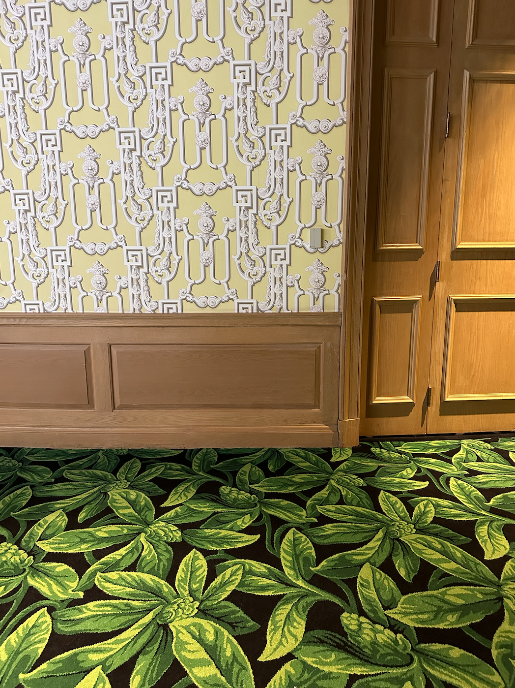
Who? Who thought this was a good idea?

The combo of the yellow trellis wallpaper, the medium-toned wood, and the rhododendron bud carpeting is an abomination. The paneling looks cheap (it’s the color, I think), and the wallpaper looks left over from another project. The carpeting is fine in general…I just feel bad for it here. It’s saying, “I know, I know…I was just coming in from another room, minding my own business, when these WALLS happened. Just keep looking down, keep looking down.”

The space doesn’t look intentional. And that’s my whole thing: if you’re going to take design risks, you’ve got to OWN them. I don’t know if Dorothy Draper actually put this hallway together, but if she did, I guarantee it was at the end of a very long day.

But. We’re not going to let those few examples deter from the wonderful whimsy of the Greenbrier overall. It is a cheekily grand, uplifting place that reminds us not to take ourselves too seriously. And that’s a reminder we all need from time to time ;)

Log Out

Dog on purple and white plaid chair

Annie Elliott Design is booking projects for late spring 2026. Please contact us to discuss.

Category: Historic houseTag: black and white floor, Carleton Varney, checkerboard floor, Dorothy Draper, Greenbrier, pattern mixing, Resort, Victorian Writing Room, wallpaper

Sidebar

Subscribe


Bossy Color Blog

Categories

  • Art + accessories »
  • Bedroom »
  • Color + paint color »
  • Dining room »
  • Furniture + upholstery »
  • Kids »
  • Kitchen + bath »
  • Lighting »
  • Living Room + Family Room »
  • Renovation »
  • Rugs »
  • Wallpaper »
  • Window treatments »

View Portfolio

view Bossy Color's portfolio

Instagram

annieelliottdesign

View Instagram post by annieelliottdesign

Apr 30

Open post by annieelliottdesign with ID 18088806227011860
Florals? For spring? Groundbreaking.But nothing says spring like flowers! 🌷 🌻 🌸 (And birds!)

annieelliottdesign

View Instagram post by annieelliottdesign

Apr 28

Open post by annieelliottdesign with ID 17870996082665526
Your house should reflect *you*. My recent visits to Eudora Welty’s house and the Mississippi Museum of Art reminded me of that. If the wallpaper you put up makes you happy, it’s a success! If you need help figuring out how to translate your personality and lifestyle into your home’s function and appearance, I’m here 😉.Read my new blog post for more!

annieelliottdesign

View Instagram post by annieelliottdesign

Apr 24

Open post by annieelliottdesign with ID 18099336653042952
Annie Elliott Design is a proud sponsor of the 87th annual @flowermartdc! I hope to see you all there! I will be there on May 1st shopping for peonies, yellow roses, and Black-Eyed Susans. 🌸 🌹 💐 #flowermartdc #springflowers #interiordesign

annieelliottdesign

View Instagram post by annieelliottdesign

Apr 22

Open post by annieelliottdesign with ID 18064935869348067
The star of today’s Wallpaper Wednesday is Farrow & Ball’s Lotus!The dramatic Lotus pattern is in the Art Nouveau style of the late 19th century and veeeeery early part of the 20th. (The pattern’s curved, stylized, botanical shapes are a classic indicator of Art Nouveau style.) Today, Lotus wallpaper is available in 19 colorways — or coloUrways, since Farrow & Ball is British ☺️ — and the metallic ones are quite spectacular. F&B changes its wallpaper colorways with annoying regularity; once they cease making a paper, that colorway is considered “archived.” But fear not: ANY F&B wallpaper pattern can be made in ANY F&B paint…all it takes is time and money.If you’re a Succession fan (I struggled, but I made it through), you may remember Lotus from Season 3, in Rava Roy’s foyer.#interiordesign #wallpaper

annieelliottdesign

View Instagram post by annieelliottdesign

Apr 20

Open post by annieelliottdesign with ID 18113514817783580
You know my thoughts about small rooms and wallpaper: bold, large-scale paper totally works! Your gateway drug is powder rooms. They’re the perfect place to experiment with whimsical patterns and bright colors because you don’t spend a ton of time in there. Although * I * argue that when you have the right wallpaper, you’ll want to ;)

annieelliottdesign

View Instagram post by annieelliottdesign

Apr 8

Open post by annieelliottdesign with ID 18338258239300458
When you come home after a long day, do you want your foyer to rev you up or calm you down? Decide which approach you need and run with it. Add large-scale wallpaper and layered rugs for excitement, or paint the walls off-white and be selective with your artwork and mirrors for calm. #foyer #homedesign #foyerinspiration

annieelliottdesign

View Instagram post by annieelliottdesign

Apr 1

Open post by annieelliottdesign with ID 17918392215338642
This will come as no surprise, but I think about window treatments a LOT. Especially during the transition from winter to spring, with the change in temperature and light…I’m reminded what a critical design element window treatments are. And then I get to thinking about window treatments through the ages. Who invented drapes? Did the Romans *really* invent Roman shades?I decided to do some digging. Check out my blog to see what I discovered!📸 @stacyzaringoldberg📸 @jennverrierphoto#windowtreatments #drapes #interiordesign

annieelliottdesign

View Instagram post by annieelliottdesign

Mar 25

Open post by annieelliottdesign with ID 18088729466185965
It’s Wallpaper Wednesday! Today we feature Brunschwig & Fils’ Les Touches. @brunschwigfils introduced Les Touches in 1965, and the pattern soon became a Brunschwig classic. (Interestingly, “touches” translates to “keys” or “strokes…” I guess that’s close to “dabs,” which is what I’d assumed.) According to handwritten records, Les Touches is inspired by post-WWII black and white photographs, but the connection between this inspiration and the pattern remains a mystery. Referred to most often as a stylized animal print, Les Touches is a staple of the Le Jardin Chinois collection.Today, Les Touches comes in 18 colorways, but the blue colorway remains iconic. I’ve used Les Touches for window treatments and upholstery, but I can’t wait to try it as wallpaper!

annieelliottdesign

View Instagram post by annieelliottdesign

Mar 23

Open post by annieelliottdesign with ID 17860517745617635
Let’s talk about what fabric doesn’t work ❌ for the Roman shades in this teenage girl’s bedroom with 2 big windows and a statement ceiling. Even though these fabrics are beautiful on their own… they don’t work here. Biggest mistake: repeating the same motif (moths, butterflies, etc.) across the room. It starts to feel themed instead of designed.Watch part 1 for the full context, and watch part 3 to find out what I would choose.#interiordesign #wallpaper #interiorsandhome
Follow

Looking for something?

Don’t miss a single post


Where classic and modern hang out and drink gin.

  • Instagram
  • TikTok
  • Pinterest
  • Facebook

© 2026 · Annie Elliott Design · privacy policy