• Skip to main content
  • Skip to header left navigation
  • Skip to header right navigation
  • Skip to site footer
  • about
    • services
    • team
  • portfolio
  • press
Annie Elliott Design, Washington DC

Annie Elliott Design

Greater Washington DC

  • book
  • blog
  • contact

Best, boldest post-pandemic paint colors for front doors

Annie Elliott | May 9, 2021

It all started with my friend Sarah up the street. You should read her books, by the way; they (and she!) are amazing. Sarah was agonizing over a color for her front door, and she asked for my opinion.

I sauntered up the street and was greeted by this:

Front door with many paint samples on it
“The pandemic has not been conducive to the completion of my next novel,” this door is saying. Zoë the Miniature Schnauzer is simply saying, “Help.”

Oh, dear. “Well!” I said heartily. “We have options!” I made a mental note to check in with her husband later.

I thought we’d go with one of the greens. Limey, nearly chartreuse, like this one:

Green paint sample on blue door
Good, right?

But it just didn’t feel like her. She deliberated for days and finally nixed the idea of green altogether. The purplish color I recommended, though…that was speaking to her.

So Mulberry it was.

Blue house with purple front door
!!! There’s not even much door on Sarah’s front door, and still the aubergine-y purple packs a punch

I mean, we could have gone with a red, or a dark green, or even charcoal or black. But Sarah is a risk-taker, and she rejects the expected (like some other people I know). Thus, Mulberry.

Purple front door on blue house
Love it. We also painted the trim around the door off-white to accentuate the detail there

That got me to thinking. Why would anyone do the expected now, having survived a truly miserable year? Let’s surprise each other! Let’s surprise ourselves!

Why not paint your front door orange?

Contemporary house with orange front door
Orange works both with contemporary…
Blue traditional house with orange front door
…and traditional architecture.

Or light aqua?

House with very light blue front door
I love all those panes of glass, too. From Addison’s Wonderland
Brown house with light blue front door
The brown of the house really makes the door pop! From House Beautiful

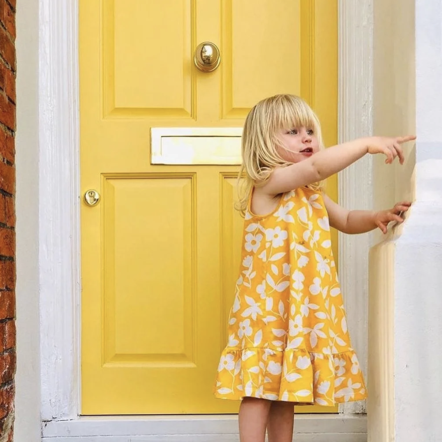
Why not paint your front door yellow?

Gray house with yellow front door
I’m not usually a big fan of Craftsman, but in yellow – yes, please!
Isn’t she darling?! From Farrow & Ball

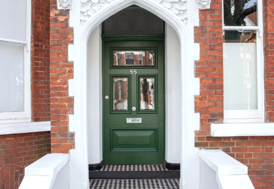
Why not paint your front door grassy — not hunter, not forest — green?

White house with kelly green door
From HomeCurbAppeal.com
Brick house with green door
This one is barely light enough to qualify as “grassy,” but I couldn’t resist that black and white floor. From Farrow & Ball, naturally

Or super light pink?

White house with light pink front door
It’s just so PRETTY! From Southern Living, of course (they corner the market on pretty)

Or, while we’re on the subject of pink, how about salmon?

White house with salmon pink front door
Again – pretty! Again – from Southern Living. Don’t you love how the salmon color works w/ the brick next door? That was no accident. From Benjamin Moore

Or bright pink?

Light green house with pink front door
Tilly welcomes you to our house! My daughters love the door so much that on their party invitations they write, “The House With the Pink Door” as the address. So far, everyone’s been able to find it

Come to think of it, the only color I DON’T like for a front door is white. It looks unfinished to me.

White front door on yellow house
I think black would have been so much better

So, facelifts all around! For your houses, I mean. Let’s wait until the next pandemic for the other kind.

For tips about painting your front door — e.g., do you paint the trim, or just the door? — please see my newly launched TikTok channel. (I know. I was hesitant. If you hate it, please don’t tell me.) Additionally, though, if you like the green front doors in this post, you might want to read about green being my color of the year for 2021.

Annie Elliott Design is based in Washington, DC, with satellite offices in St. Michaels, Maryland and in Middlebury, Vermont. Annie’s design work and insights have appeared in numerous local and national publications, including HGTV Magazine, The Wall Street Journal, The New York Times, The Washington Post, and Washingtonian Magazine. 

Category: Color + paint colorTag: front door, front door colors, green front door, light blue front door, paint colors, pink front door, purple front door, Sarah Blake, yellow front door

Sidebar

Subscribe


Bossy Color Blog

Categories

  • Art + accessories »
  • Bedroom »
  • Color + paint color »
  • Dining room »
  • Furniture + upholstery »
  • Kids »
  • Kitchen + bath »
  • Lighting »
  • Living Room + Family Room »
  • Renovation »
  • Rugs »
  • Wallpaper »
  • Window treatments »

View Portfolio

view Bossy Color's portfolio

Instagram

annieelliottdesign

View Instagram post by annieelliottdesign

Sep 17

Open post by annieelliottdesign with ID 18125330714481993
When you become an empty nester, when is it ok to reclaim your adult child’s space? Check out my latest blog post for my recommendations on how to approach empty nesting!📸 @stacyzaringoldberg📸 @kipdawkinsphoto📸 Michael Wilkinson📸 @angieseckinger

annieelliottdesign

View Instagram post by annieelliottdesign

Sep 10

Open post by annieelliottdesign with ID 17906571285498443
Pink, green, and a splash of dark orange come together to create this sunny, summery bedroom 🪷

annieelliottdesign

View Instagram post by annieelliottdesign

Sep 9

Open post by annieelliottdesign with ID 18104009318233584
It’s Wallpaper Wednesday! This week, feast your eyes on @timorous_beasties Fruit Looters. TB claims that William Morris’s Strawberry Thief pattern inspired Fruit Looters, but only the name indicates the connection: Strawberry Thief, Fruit Looters…get it? Whereas Morris’s iconic pattern is medium-scale, rhythmic, 2-D, cartoon-like, and muted, Fruit Looters is the opposite in every way but subject matter. The scale is huge, with the foliage “stripes” providing a geometric order, and it oozes TB’s trademark edginess. The crisp pattern is finely drawn; pull it apart, and each element — a flower, a bird — could be in an English botanical print. Fruit Looters comes in vivid, saturated colorways, some with a metallic sheen, and dramatic black is present in all.Recently, a client (who originally introduced me to Timorous Beasties!) and I used Fruit Looters wallpaper in her stairwell, in the Alabaster colorway. The drama. Oh, the drama!

annieelliottdesign

View Instagram post by annieelliottdesign

Aug 27

Open post by annieelliottdesign with ID 18339370936281789
SO much fun to create this entertainment space! This client already had a living room and kitchen…this space is for friends and family to relax, talk, and just BE. What’s your favorite feature?

annieelliottdesign

View Instagram post by annieelliottdesign

Aug 26

Open post by annieelliottdesign with ID 18618812233051872
Happy Wallpaper Wednesday! There’s no better paper to feature in August than Schumacher’s Citrus Garden 🍋 🍊.The Swedish designer, artist, and architect Josef Frank created the Citrus Garden pattern as a fabric in 1947. The hand-drawn, whimsical, quintessentially mid-century, irresistibly cheerful design exemplifies Frank’s philosophy: “The freer the pattern, the better.” I’ve used Citrus Garden fabric a few times, but shockingly, the pattern wasn’t on wallpaper until 2017!! 🤯 Deprived for so long!! As soon as the opportunity arises, I’m running, not walking, to get my hands on this wallpaper.@schumacher_midatlantic 📸 @angieseckinger

annieelliottdesign

View Instagram post by annieelliottdesign

Aug 19

Open post by annieelliottdesign with ID 17979208500097924
All of a sudden, novelty accent lamps are EVERYWHERE! Some are cute, some are…inadvisable ;) If you just can’t resist a lamp in the shape of a snail, my latest blog post has recommendations for proceeding responsibly💡

annieelliottdesign

View Instagram post by annieelliottdesign

Aug 12

Open post by annieelliottdesign with ID 18109874522009739
Happy Wallpaper Wednesday! Let’s talk about Cole & Son’s Acquario, shall we?Iconic Italian artist Piero Fornasetti designed Acquario for Cole & Son in the early 2010s. He was going through an ocean phase, captivated by its mysterious depths 🐠, so he developed this fish design and put it first on plates and fabrics, and then, luckily for us, on wallpaper. We just installed Acquario in the Print Room Blue colorway in a client’s tiny practice room (he plays classical guitar), and we LOVE it! That big old blowfish, just gliding along…he kills me.Featuring: @cole_and_son_wallpapers @fornasetti

annieelliottdesign

View Instagram post by annieelliottdesign

Aug 9

Open post by annieelliottdesign with ID 18436273279134156
Green, light blue, and a touch of navy come together to create a room that's bright, welcoming, and incredibly summery 🥰 🥰 🥰 #interiordesign #summercolors

annieelliottdesign

View Instagram post by annieelliottdesign

Aug 7

Open post by annieelliottdesign with ID 18065703698744445
Given that my brain is still on an academic calendar 🤷‍♀️ , I thought I'd do a little review and see which blog posts resonated with you the most in 2025-26. Who knew that a post from 2011 (!!!) is still in the top 5! Click over to the post to to see the year’s greatest hits. #interiordesign #designinspo
Follow

Looking for something?

Don’t miss a single post


Where classic and modern hang out and drink gin.

  • Instagram
  • TikTok
  • Pinterest
  • Facebook
American Society of Interior Designers Firm Partner

© 2026 · Annie Elliott Design · privacy policy